Figma
Jira
Adobe Illustrator
Adobe Photoshop
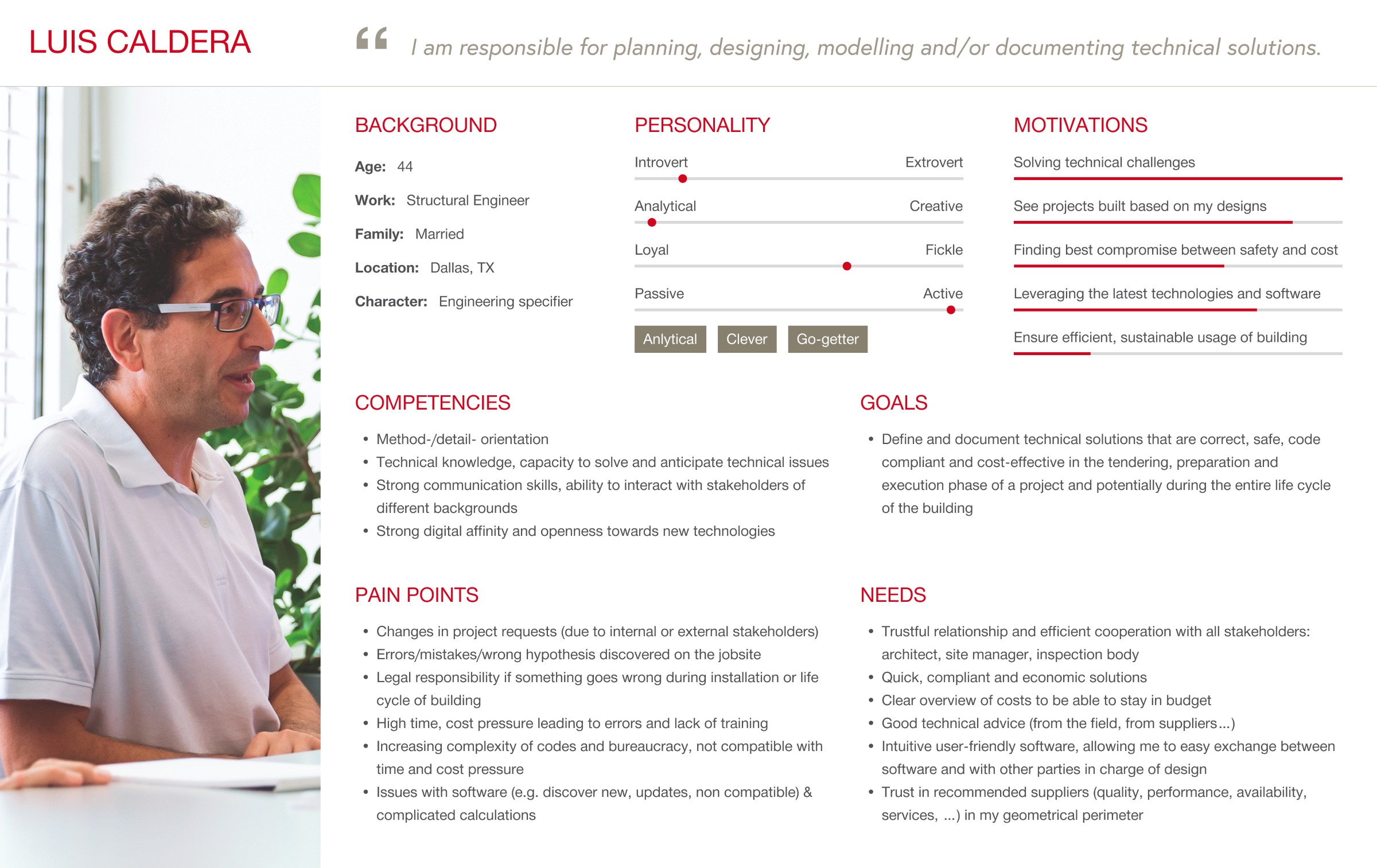
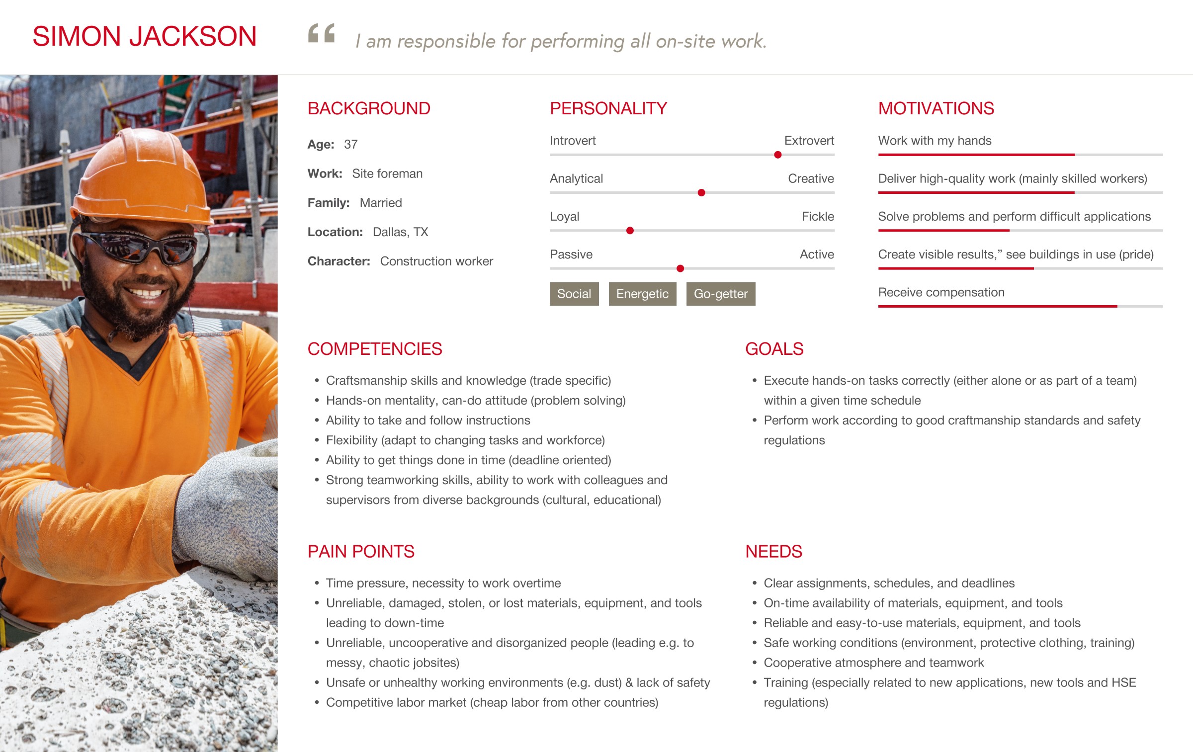
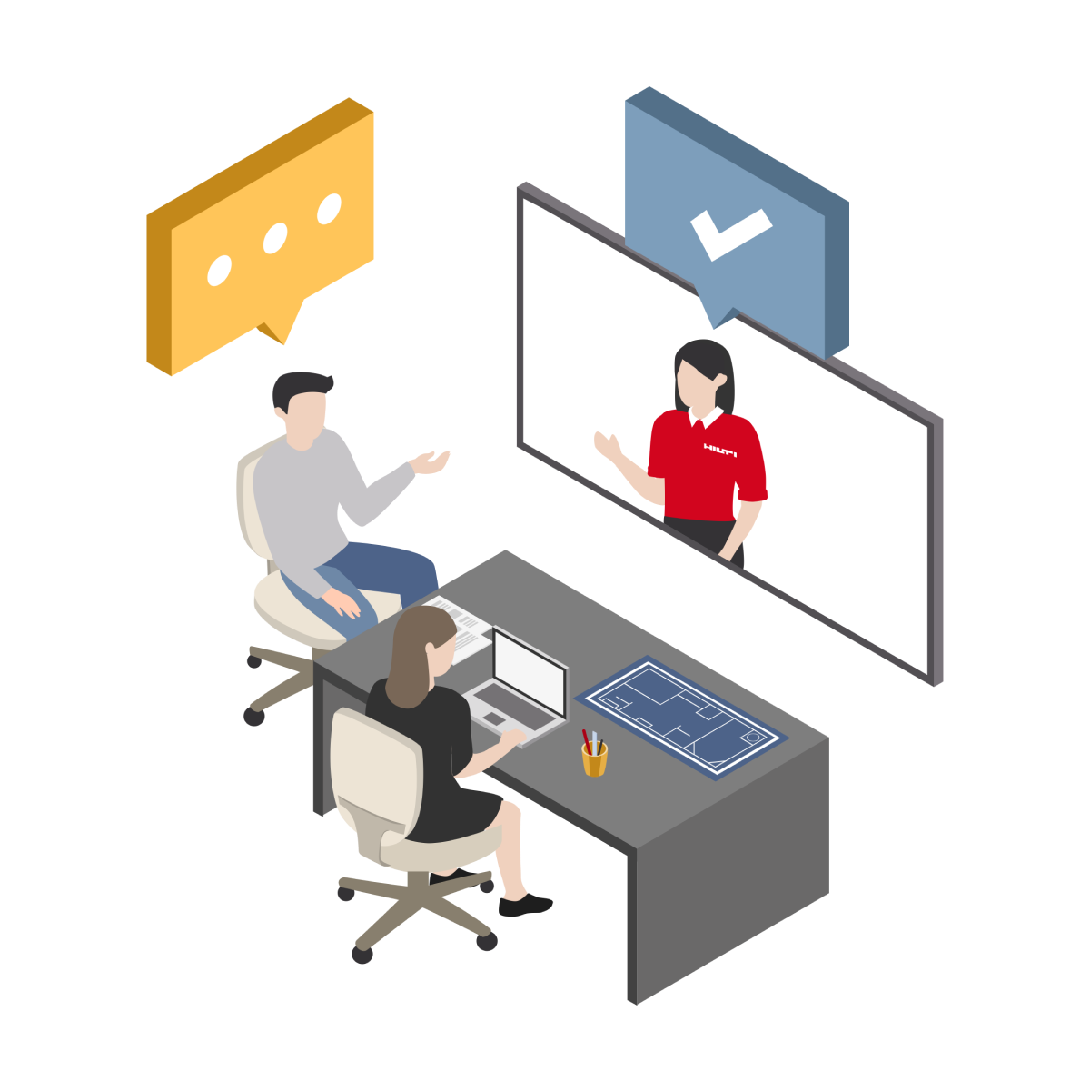
User Interviews
Miro
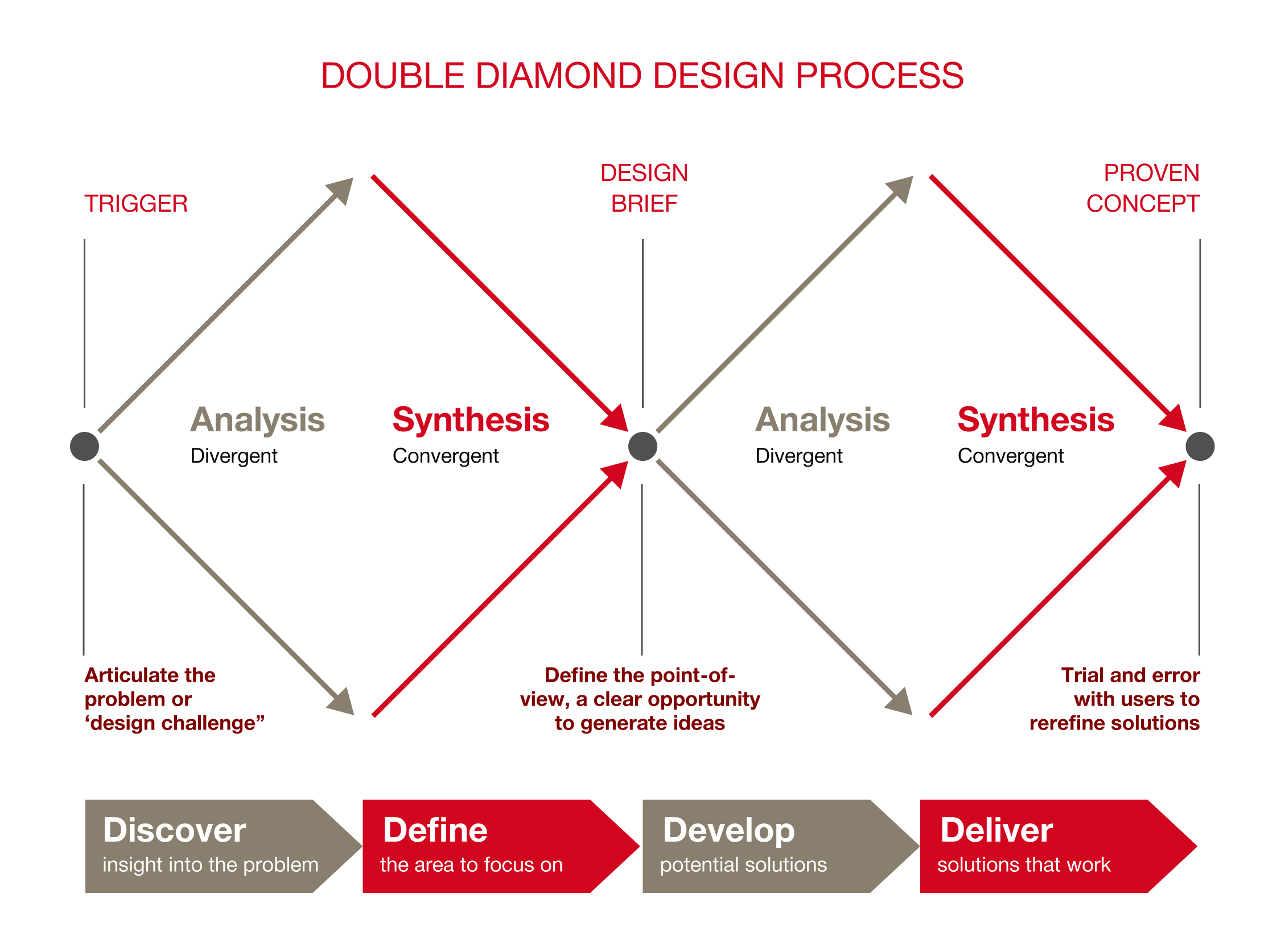
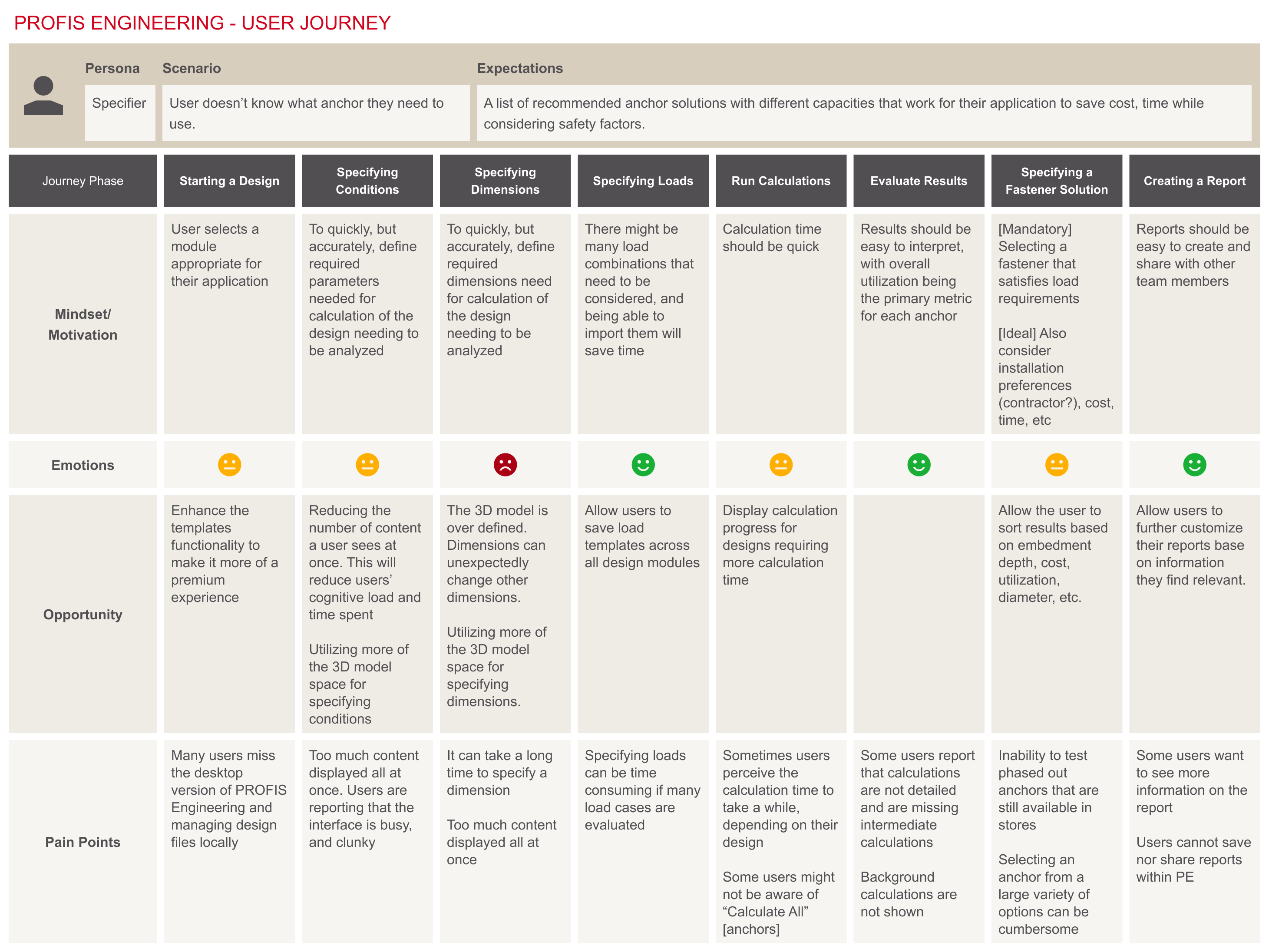
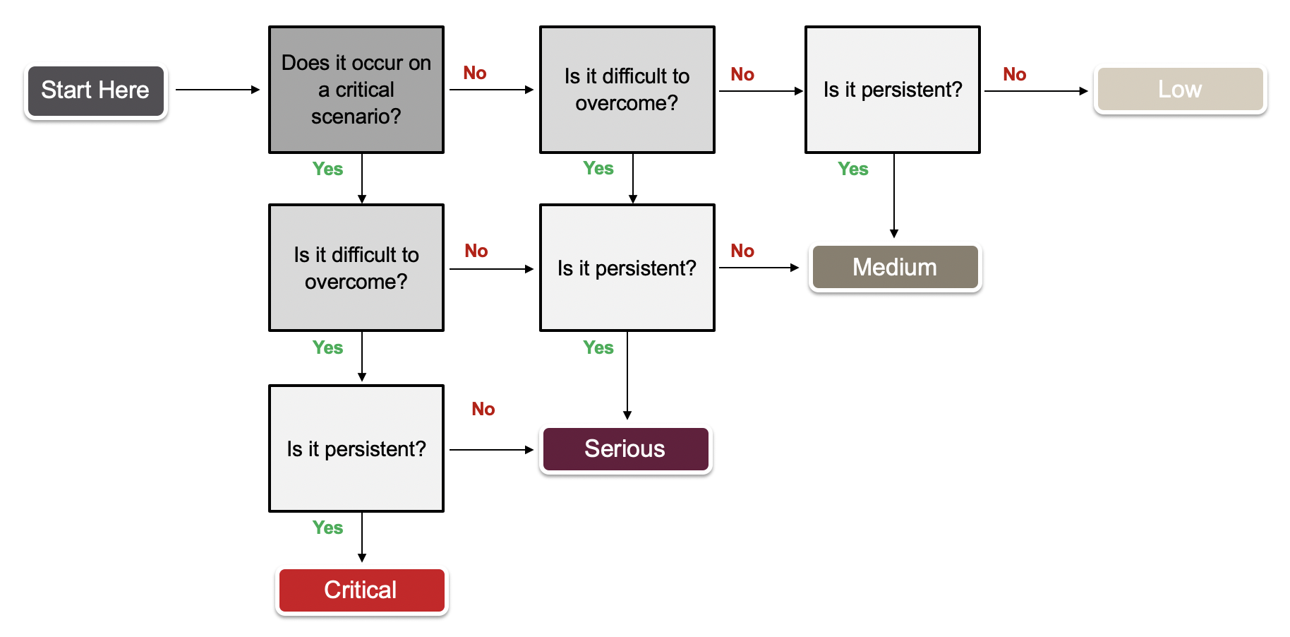
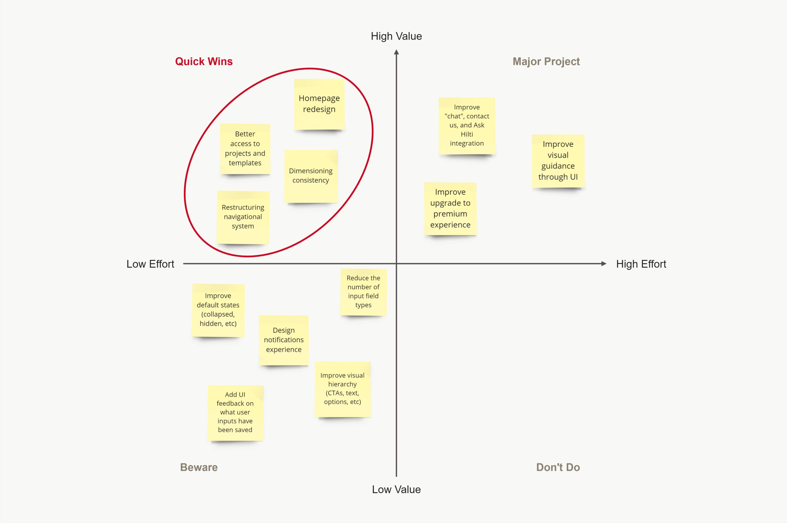
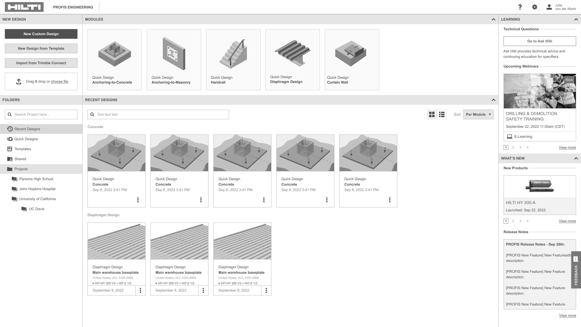
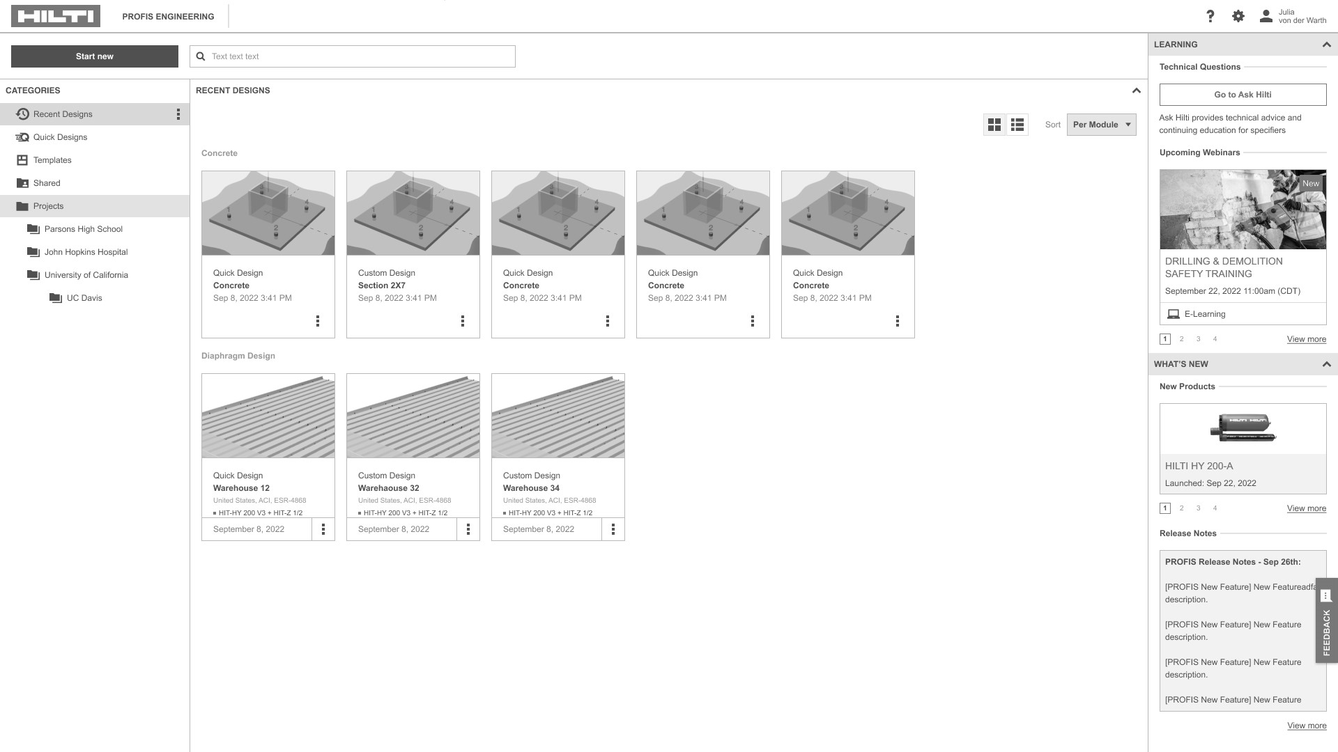
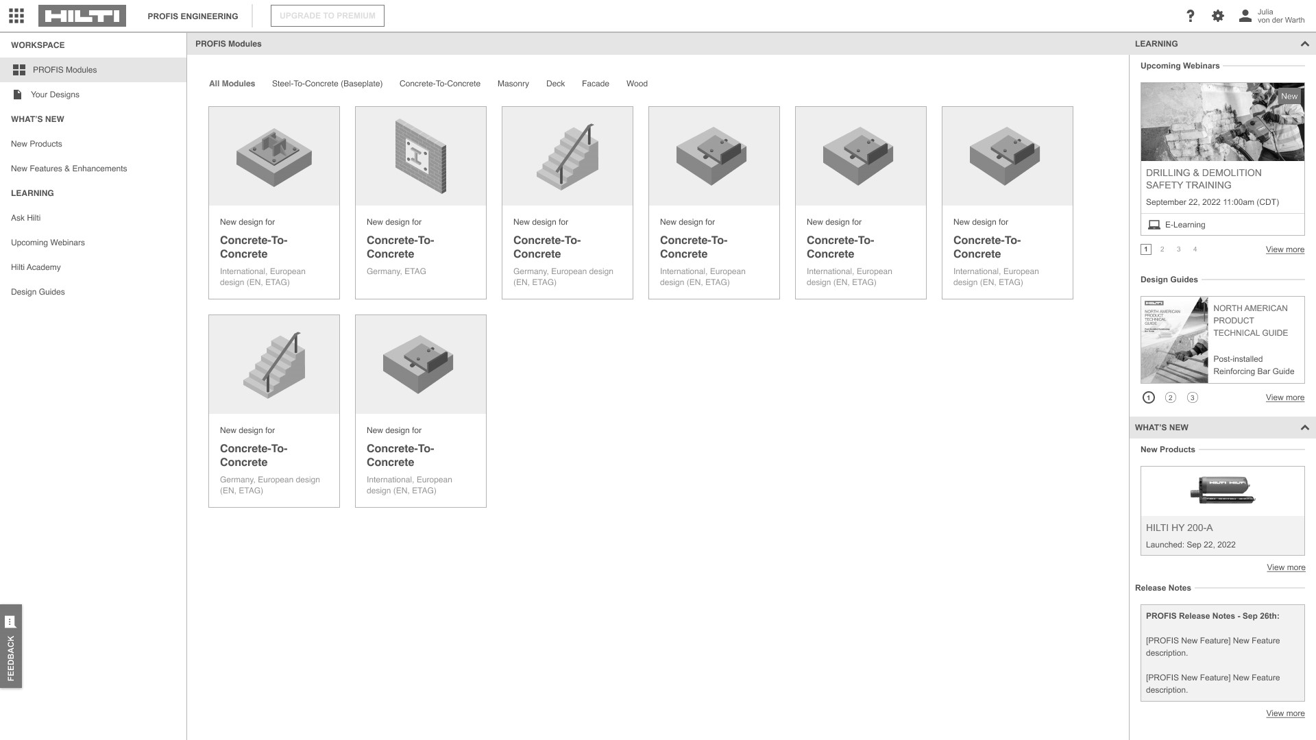
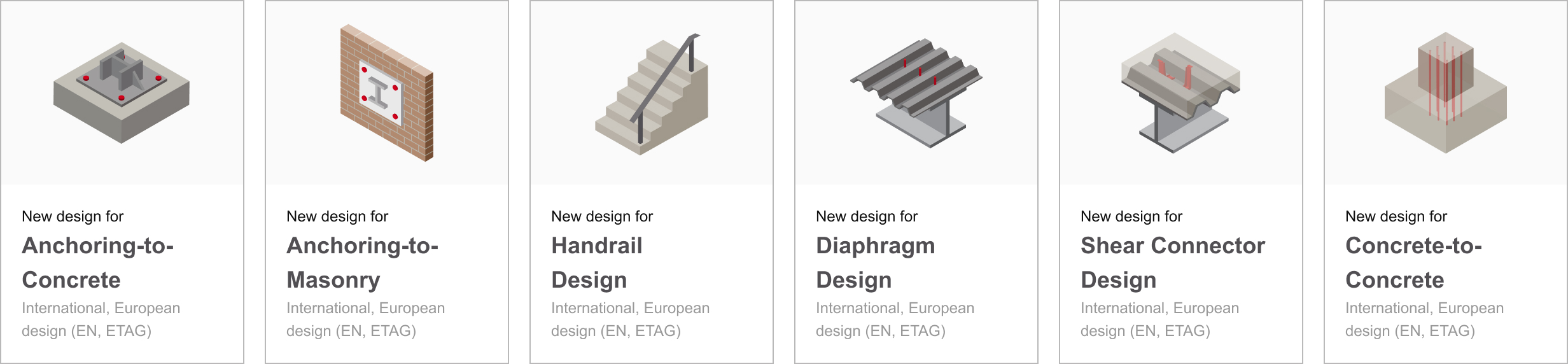
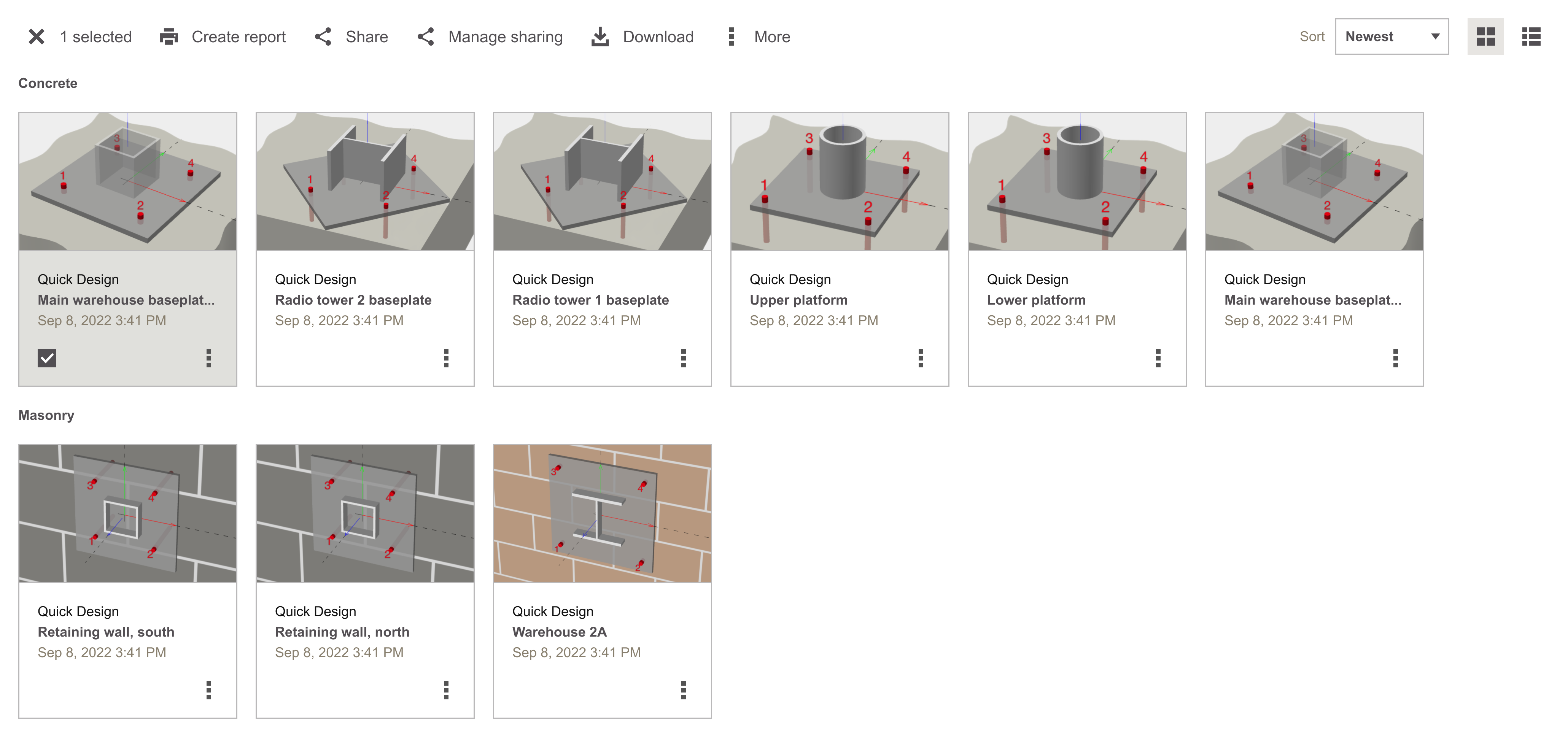
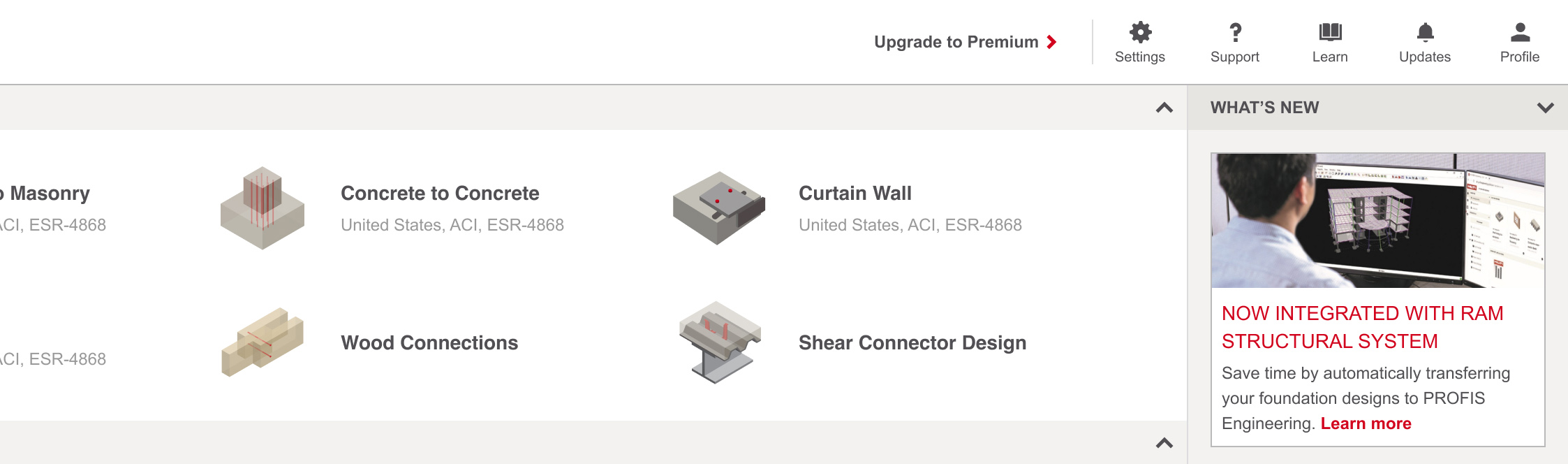
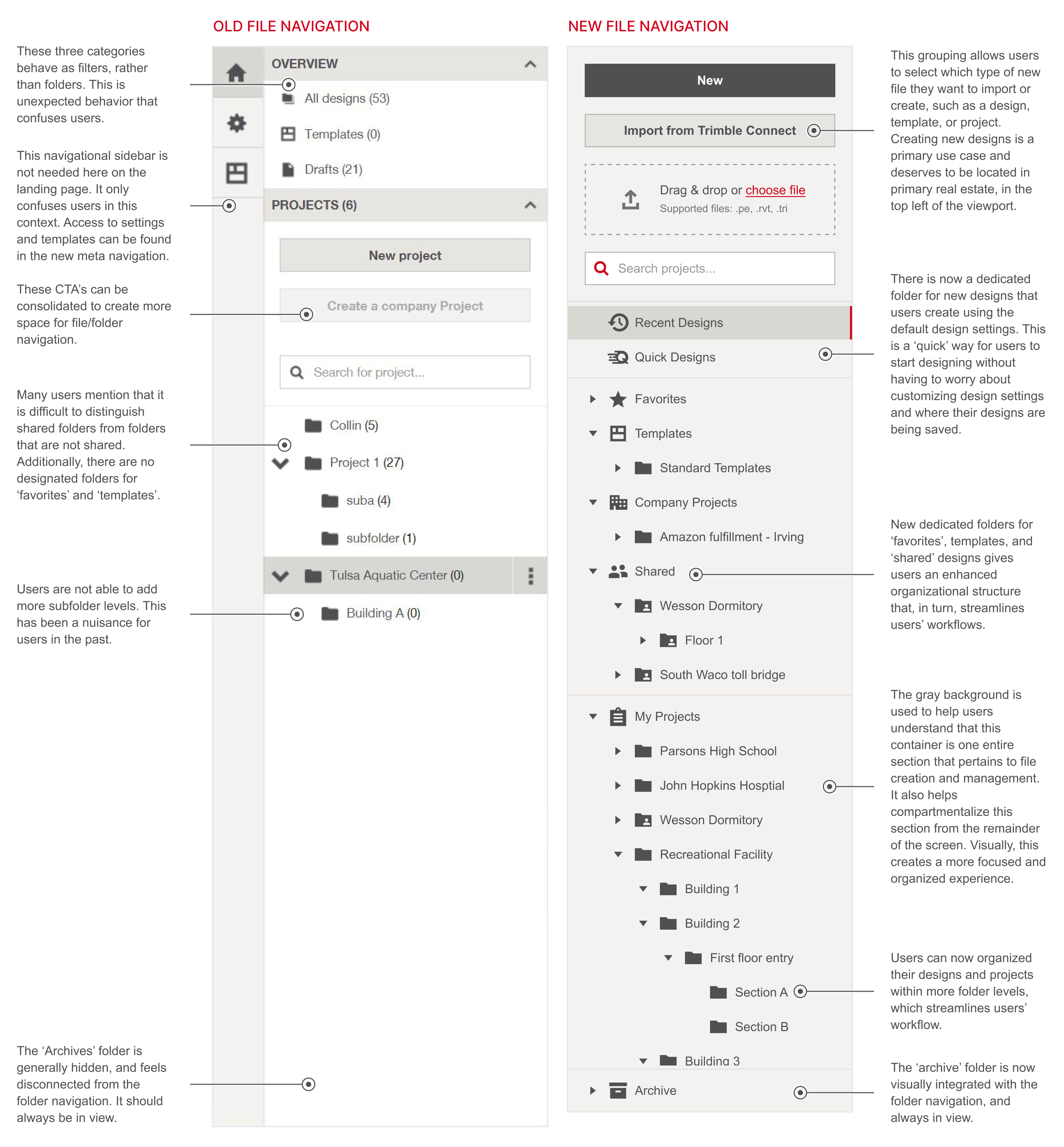
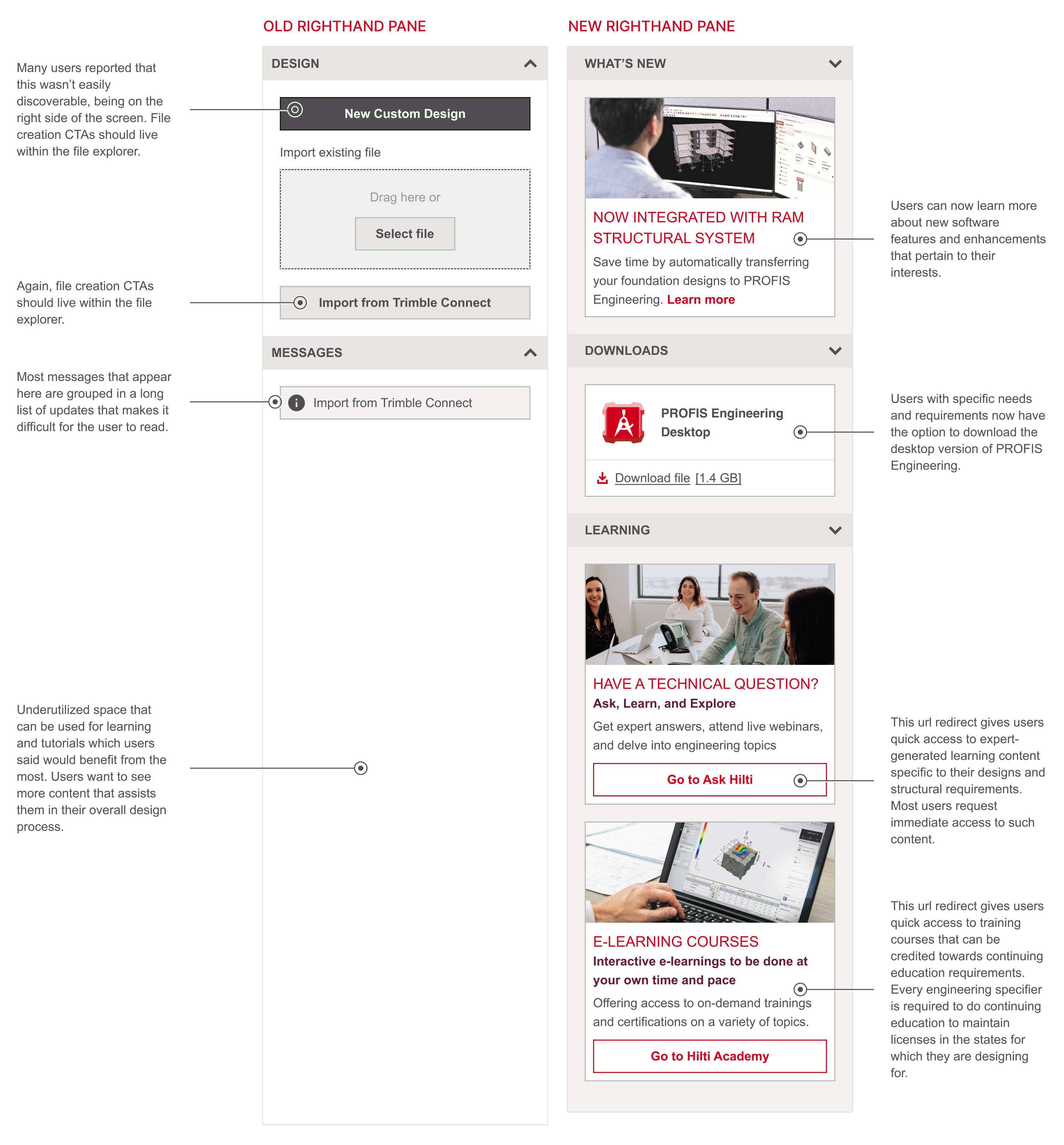
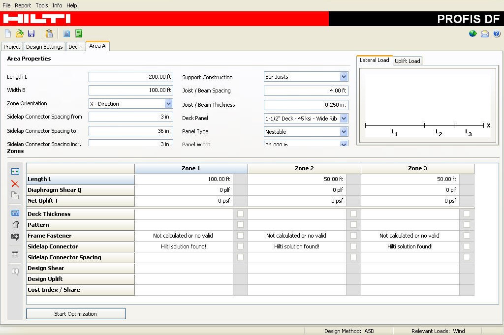
Before
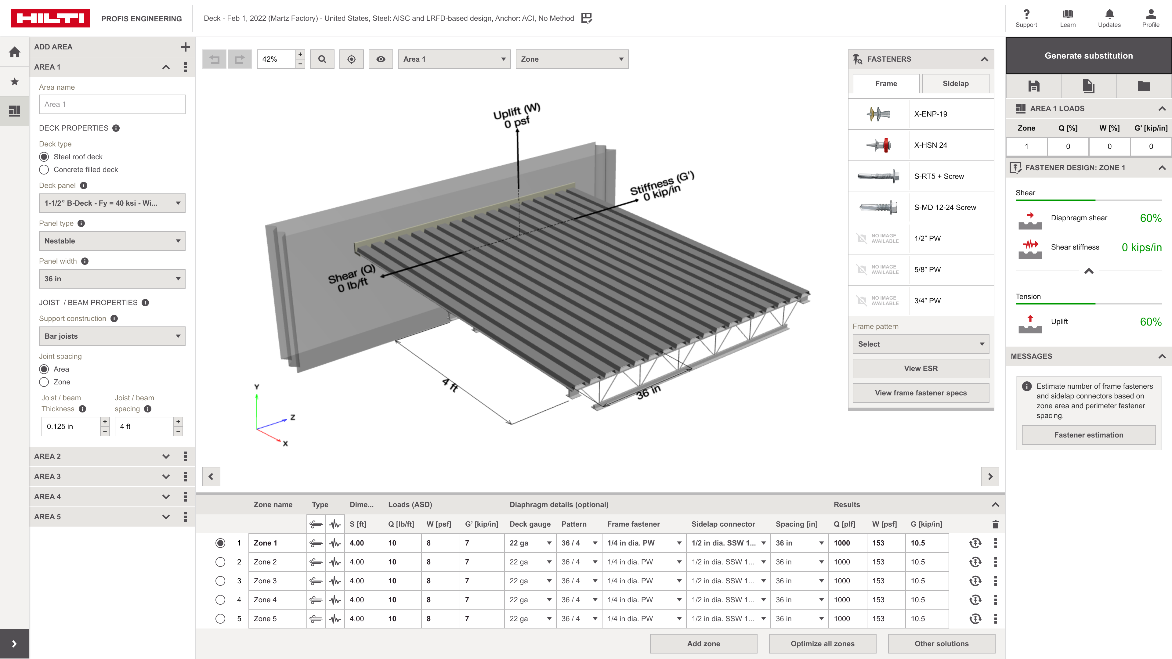
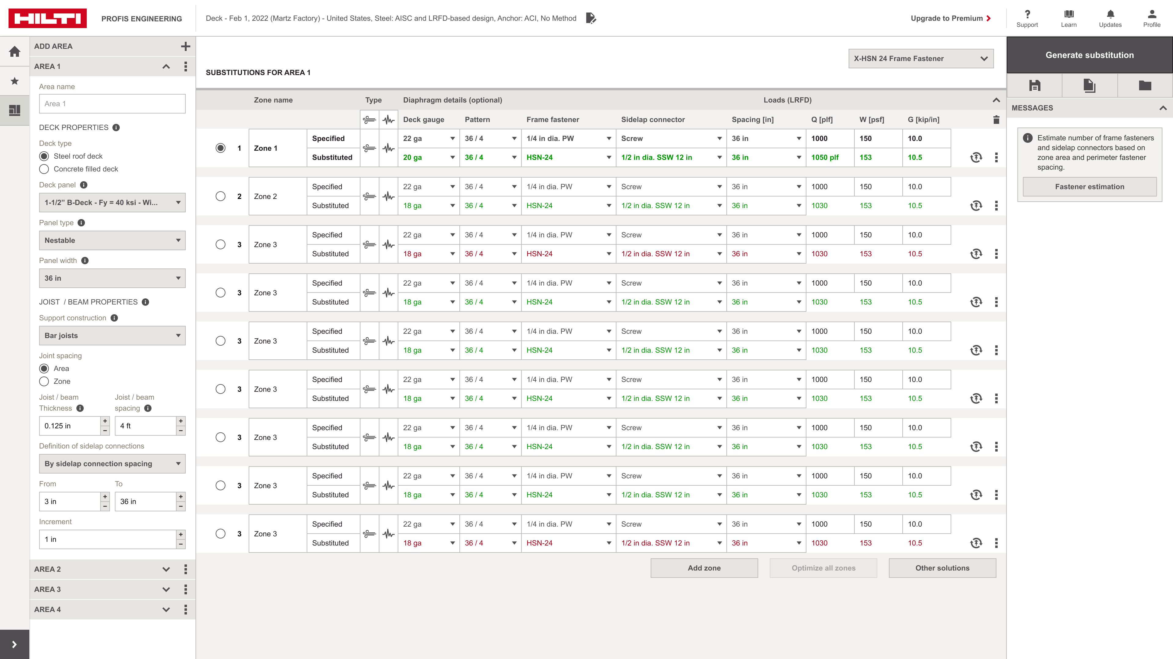
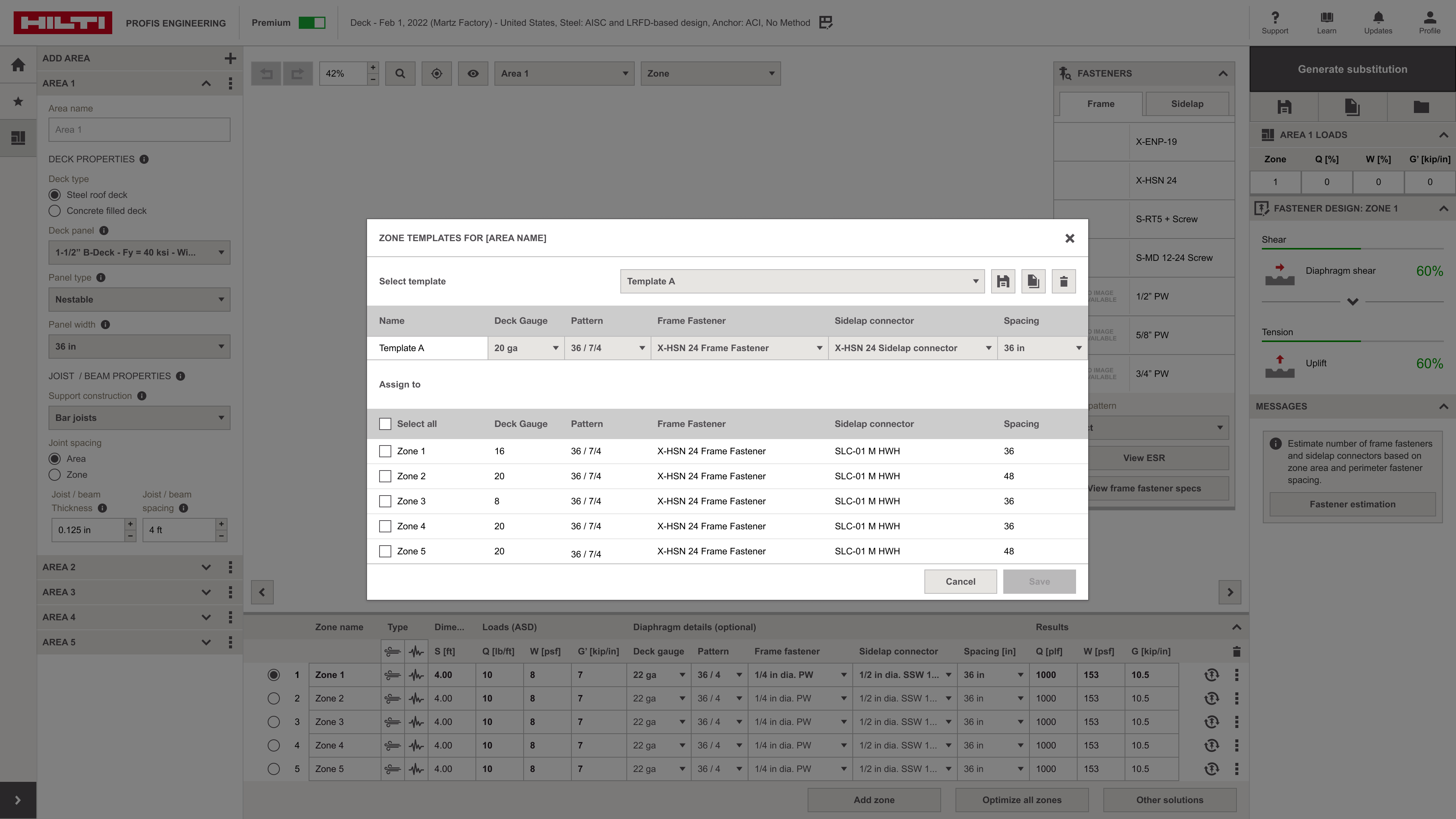
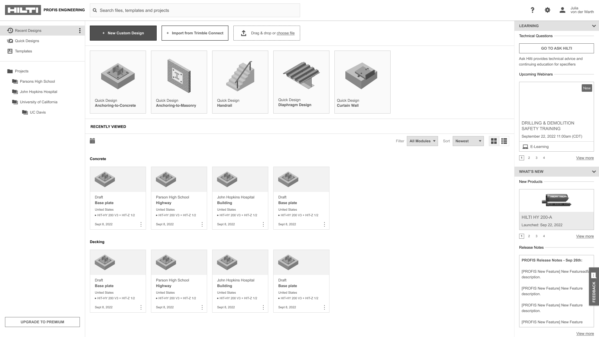
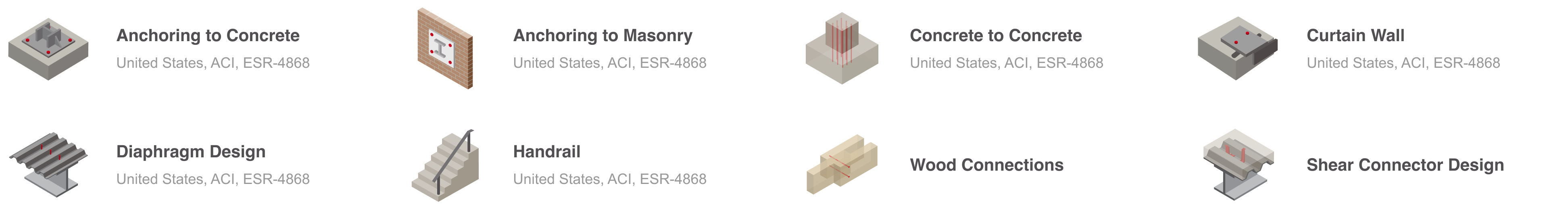
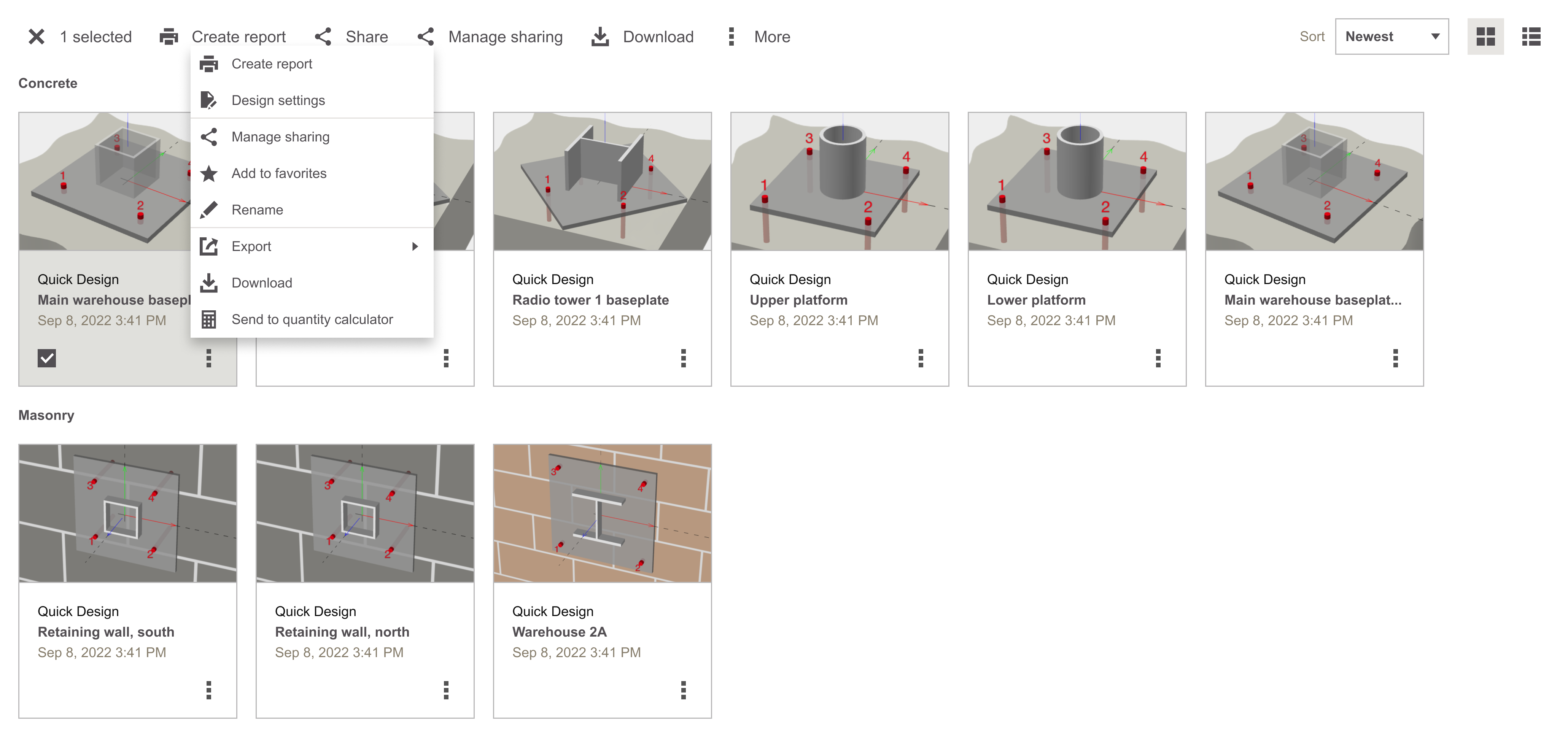
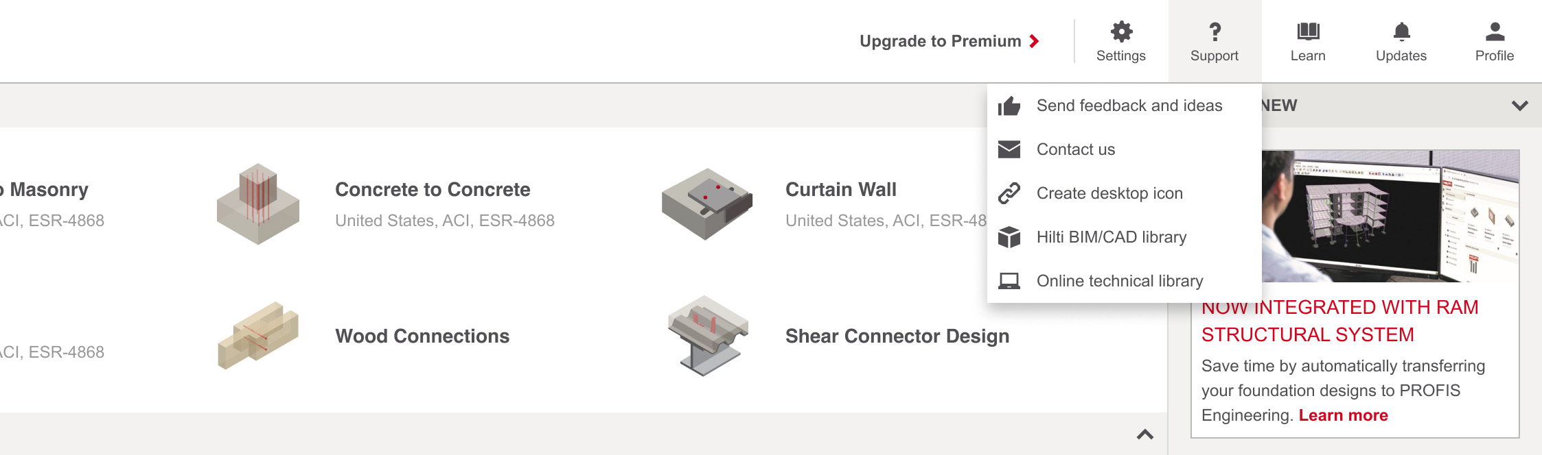
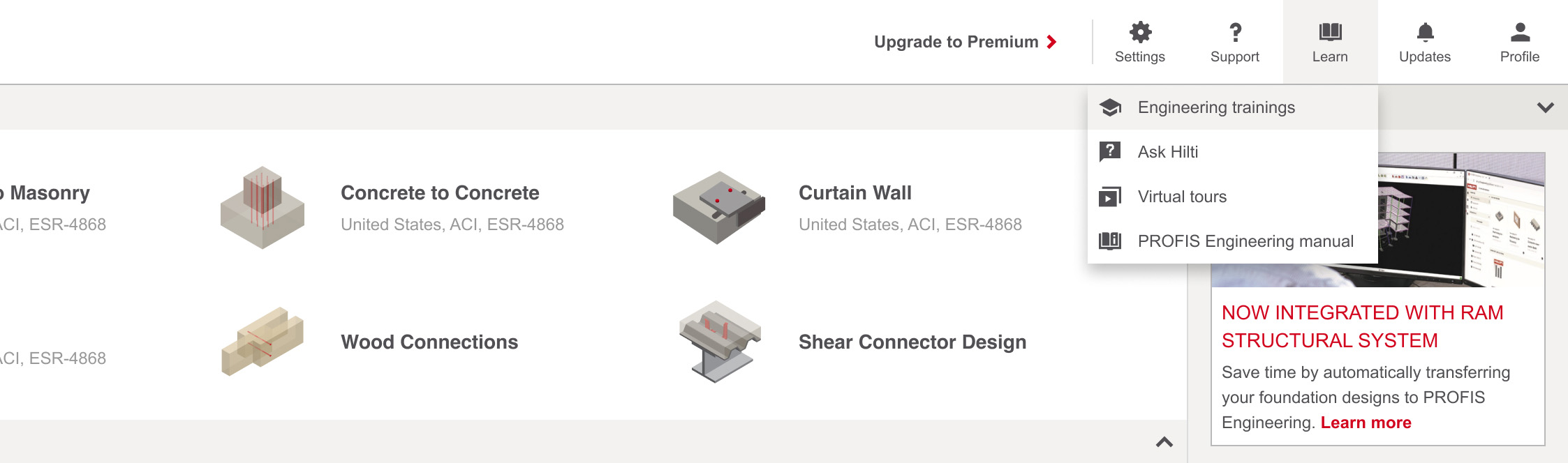
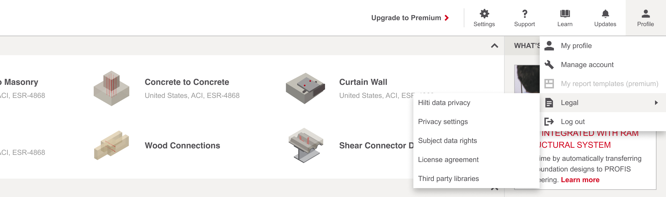
After