Picoyune is a chemical sensing company based in Berkeley, California, specializing in portable, high-sensitivity mercury monitoring systems. Founded in 2013, the company leverages plasmonic sensor technology—specifically gold nanoparticle films that detect mercury vapor through localized surface plasmon resonance (LSPR). This approach allows Picoyune to replace bulky lab equipment with compact, field-ready devices that deliver real-time, accurate mercury readings. Their innovations are especially valuable in industries like environmental monitoring, mining, and oil and gas, where mercury exposure is a critical concern.
As the UX designer for Picoyune’s plasmonic mercury monitoring system, I led the design of a user interface tailored for industrial environments where precision, clarity, and speed are essential. This project was a natural fit for me, drawing on my background in mechanical engineering and hands-on experience in the oil and gas sector—industries where I developed a deep understanding of field operations, safety protocols, and the importance of intuitive tools under pressure.
My role
My role involved translating complex sensor data into a clean, accessible interface that could be used confidently by technicians in the field. I collaborated closely with engineers and scientists to ensure the design aligned with both technical constraints and real-world workflows.
Challenge
The main UX challenge was designing an interface that could translate complex mercury sensor data into a format that’s easily understood and trusted by field technicians—many of whom operate in high-pressure, industrial conditions. It needed to balance scientific accuracy with clarity, speed, and durability, all while remaining intuitive for non-technical users.
Goal
The goal was to design a clear, reliable, and field-friendly interface that empowers technicians to monitor mercury levels with confidence—translating complex sensor data into actionable insights with minimal friction.
Process
I took a user-centered design approach—starting with research and stakeholder input to understand real-world needs, then moving into ideation, wireframing, and iterative prototyping. Throughout, I focused on aligning technical functionality with intuitive user flows, continuously refining the interface based on usability feedback to ensure the final experience was both practical and field-ready.
Toolkit
Figma
Adobe Illustrator
Adobe Photoshop
GV Design Sprint
User research
Gathering scope and requirements
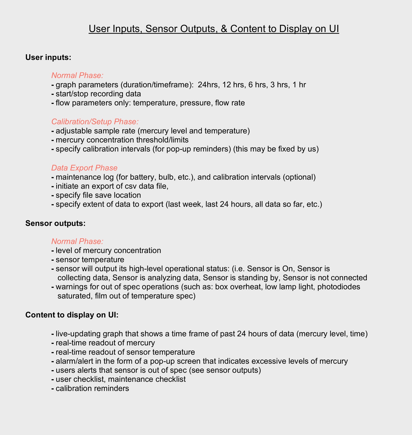
To define the scope and requirements for the UI, I began by engaging closely with stakeholders across engineering, product, and operations at Picoyune. Through structured conversations and collaborative working sessions, I gathered detailed insights into both the technical functionality of the hardware and the practical needs of field users. Because the interface directly controlled and responded to hardware functions—such as capturing sensor readings, initiating calibrations, and managing data storage—it was critical that requirements were exhaustive, precise, and aligned across teams. The result was a tightly scoped design foundation that aligned user needs with hardware capabilities from the start.
User research
To ensure the UI met the needs of real-world users, I conducted in-depth interviews with five field professionals who were experienced in mercury detection systems and would ultimately be using Picoyune’s technology. These interviews focused on understanding their day-to-day workflows, challenges with existing tools, and expectations for usability in industrial environments. By speaking directly with domain experts, I gained valuable insights into how they interpret sensor data, manage calibration procedures, and respond to alerts in the field. This input not only shaped the core functionality of the interface but also influenced design decisions around information hierarchy, interaction timing, and error handling to better align with how these users think and work.
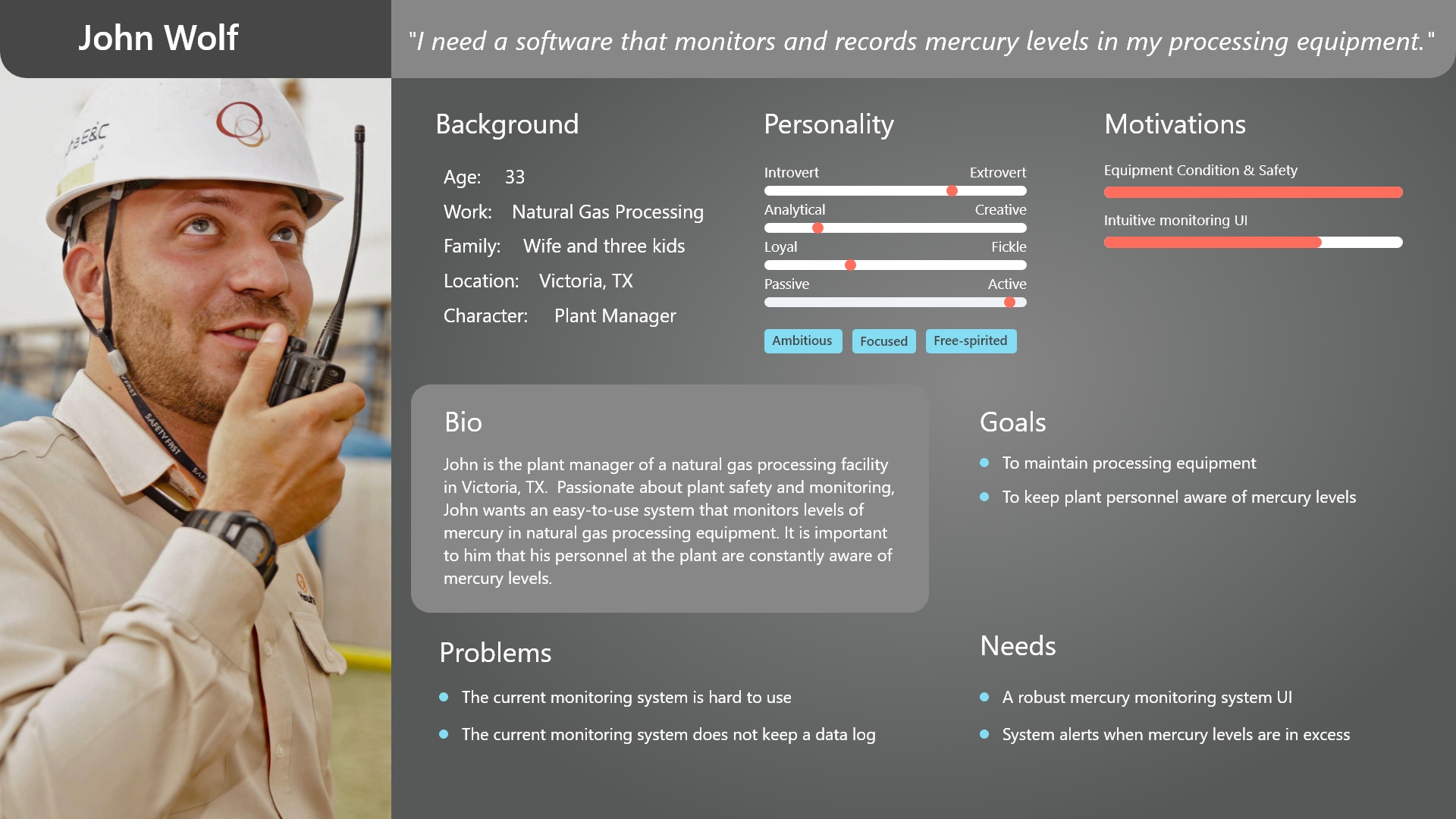
The field persona
I also used the information gathered from user research to create a persona that would guide design decisions—a plant manager at a natural gas processing facility in Texas. Responsible for safety and compliance, he needed a mercury monitoring system that was both rugged enough for industrial use and simple enough to operate without extensive training. This persona helped shape the interface around clarity, reliability, and ease of use in high-stakes environments.
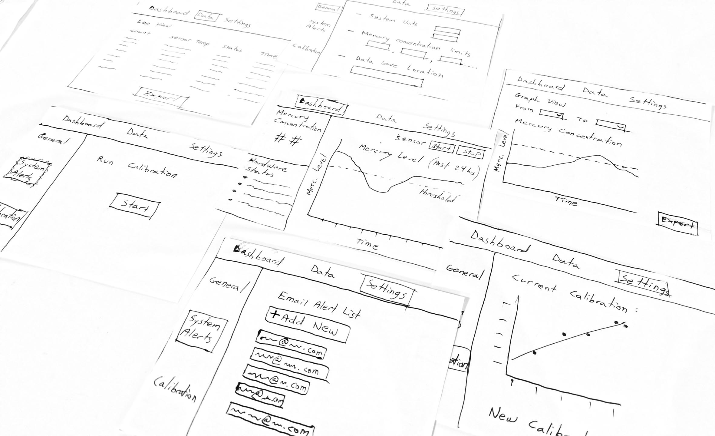
Sketching the vision
During the ideation phase, I began sketching out key workflows based on the core functional requirements of the system: analyzing stored data, live monitoring, and running sensor calibrations. I mapped each of these user tasks to a distinct interaction flow, thinking carefully about where clarity, speed, and error prevention were most critical. I experimented with layout patterns, navigation models, and visual hierarchies to ensure technicians could move seamlessly between viewing live sensor readings, accessing historical logs, and initiating calibrations—all while minimizing friction and cognitive load. This exploratory phase helped crystallize the product’s structure and informed the wireframes that followed.
The feedback loop
I led a fast-paced, iterative feedback loop centered around collaborative sketching. I shared rough interface concepts early with Picoyune stakeholders—engineers, scientists, and product leads—and also gathered input from field users with deep knowledge of mercury detection systems. Once we reached alignment on the key flows and interface structure, I built a low-fidelity prototype to test the interactions in context and overall usability. It was simple by design—focused purely on flow and logic—but it gave us just what we needed to validate our direction and converge on a clear, effective solution as a team.
Style guide
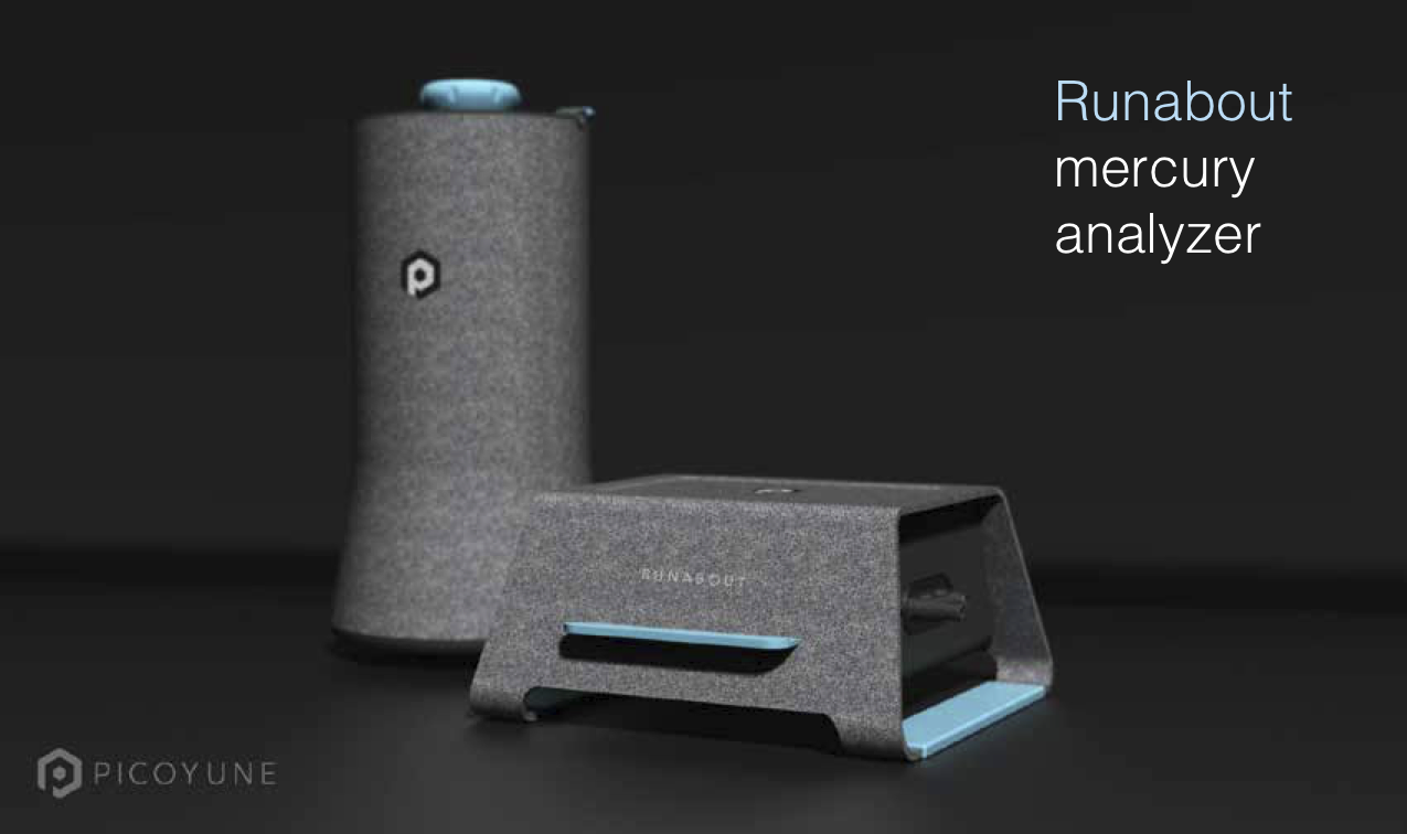
Before creating high fidelity mockups to present to the client, it was important to establish a style guide that would give direction to the “look and feel” of the brand that would be engrained in the UI. Since the client did not have a style guide or branding guidelines to go by, I asked to see what material they could provide me that would give an indication of brand direction. Picoyune had previously worked with an industrial designer to establish a concept of the exterior sensor housing and gave me the below concept to work with. From there, I started building a style guide that would align.
With a visual baseline, I started adding more colors into the mix with the idea that this type of mercury detection software needed status-level hues to define different levels of mercury. Additionally, a few gradients and shades of gray were added to the color palette to provide a sense of depth and hierarchy across the interface—making it easier for users to distinguish between critical alerts, system feedback, and background elements. These additions helped balance functionality with visual clarity, ensuring that the interface not only looked modern but also communicated levels of mercury exposure with intuitive, color-driven cues.
High fidelity design
After finalizing Picoyune’s style guide, I applied it to high-fidelity screens with a sharp focus on clarity, consistency, and brand alignment. I used color strategically—primary tones highlighted actions and alerts, while secondary accents guided attention and reinforced hierarchy. Rather than overwhelming the UI with branding, I opted for a clean, modern layout that balanced whitespace with functional density. Each component was modular and scalable, adhering to the brand’s practical aesthetic.
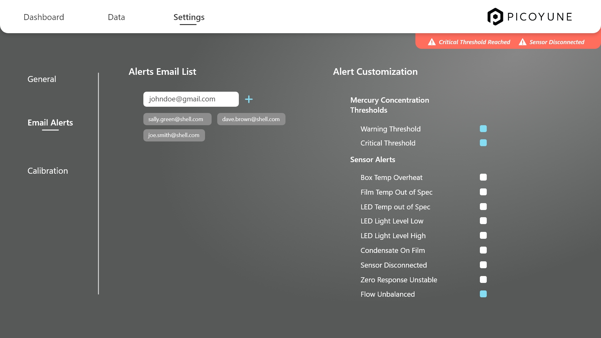
Orange was deliberately chosen as the universal signal color for warnings and errors, ensuring consistent visual recognition across all contexts—from sensor diagnostics to calibration thresholds and system notifications. Whether a user is deep in data review or navigating the dashboard, error states remain persistently visible through fixed banners, iconography, or contextual overlays. This persistent visibility reinforces urgency without overwhelming the user. To reduce alert fatigue, users can also snooze warnings at custom time intervals, giving them flexibility to manage disruptions while keeping critical information in view. This approach strikes a balance between awareness and control, keeping users informed without compromising focus.
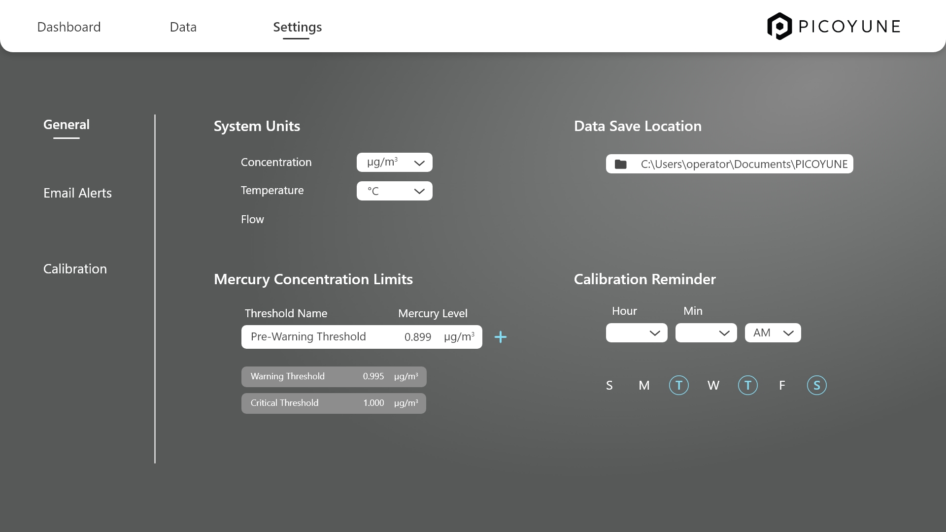
General settings
In the General Settings panel, users can easily tailor their experience by adjusting system units, mercury concentration thresholds, and calibration reminders. Units toggle between Imperial and Metric, ensuring all data updates seamlessly across the platform. Users can define custom warning and critical mercury thresholds, which drive visual alerts for proactive monitoring. Calibration reminders are also flexible—offering customizable frequencies and notification types—so users stay on top of sensor maintenance with minimal effort. The interface keeps everything clean, intuitive, and aligned with Picoyune’s precision-driven brand.
The customized email alerts UI lets users manage who gets notified and about what—fast. Email addresses are listed with quick-edit and delete options, and alert types (like calibration, mercury thresholds, or diagnostics) are selectable via a clean checklist with brief descriptions. The design keeps it simple, with clear groupings and subtle visuals to help users configure alerts without any friction.
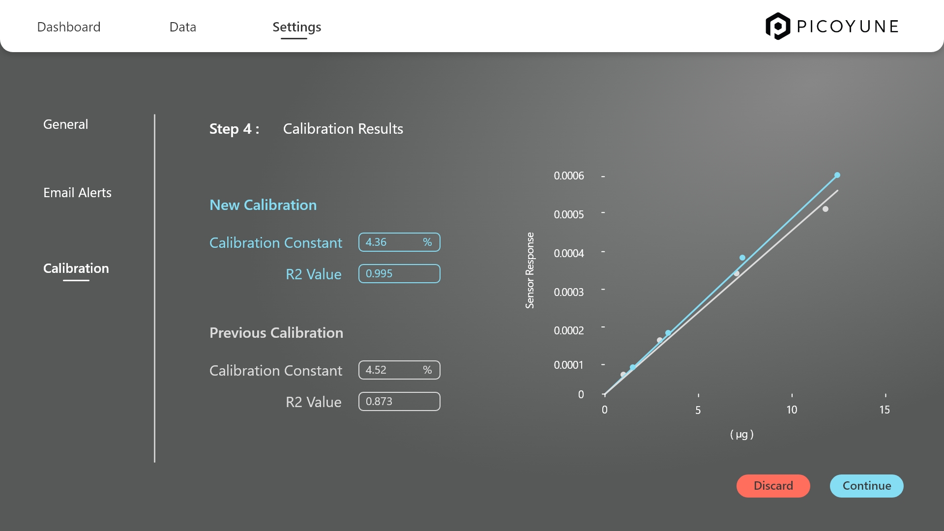
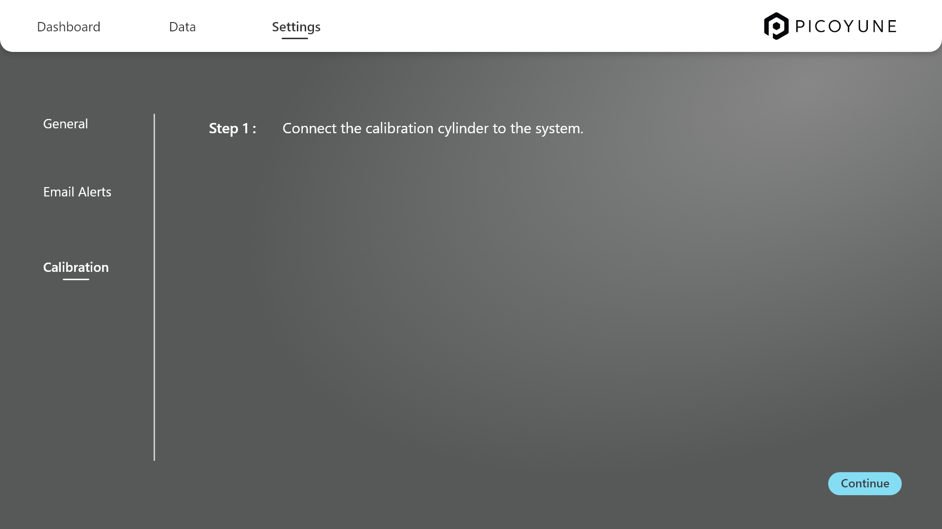
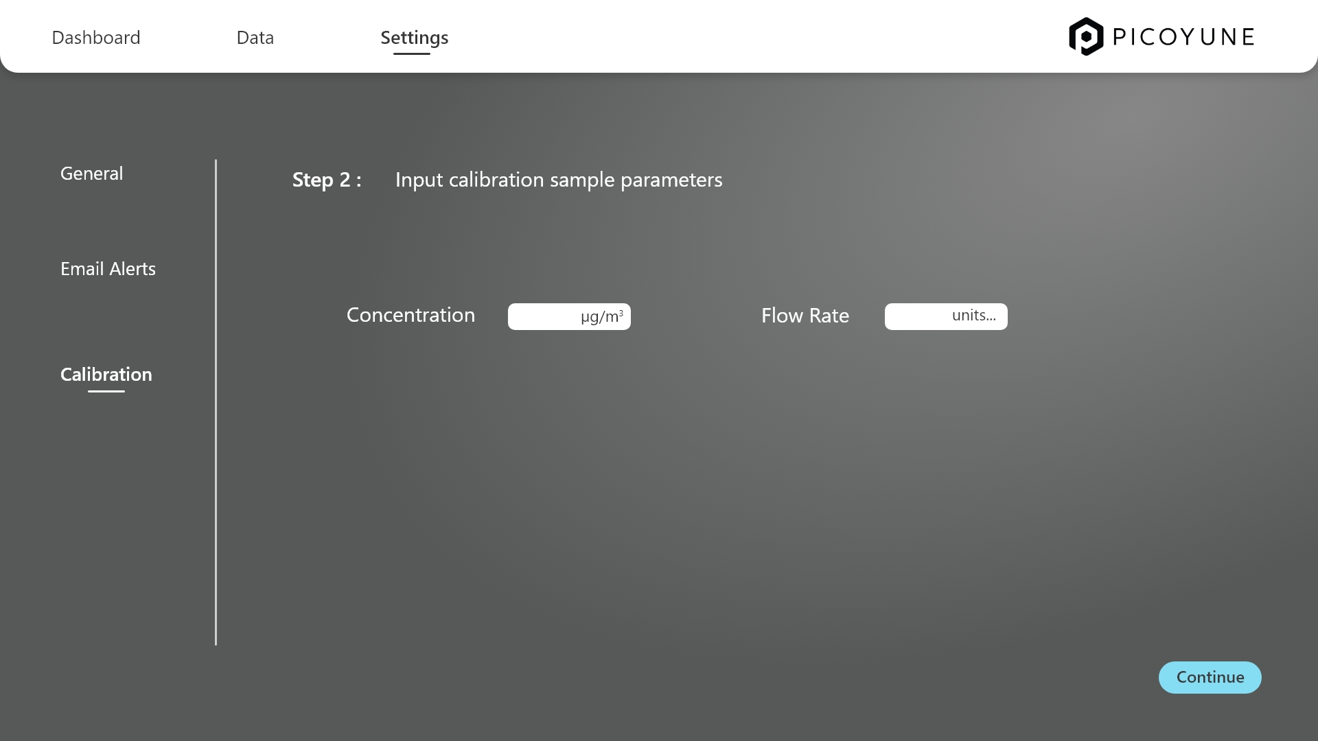
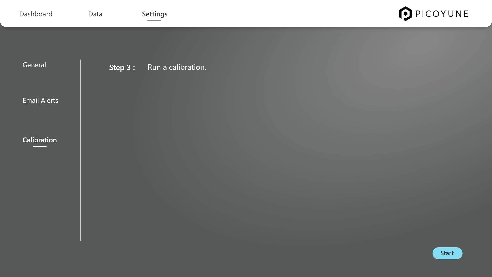
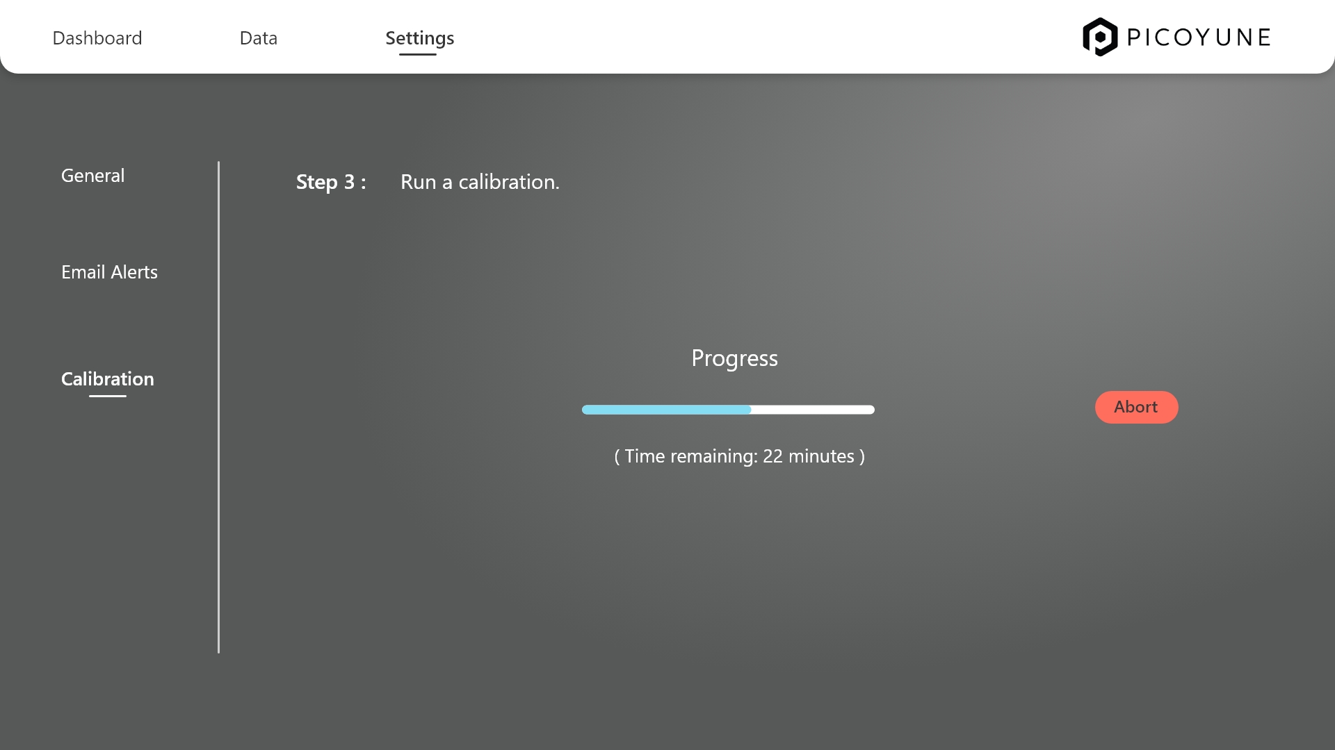
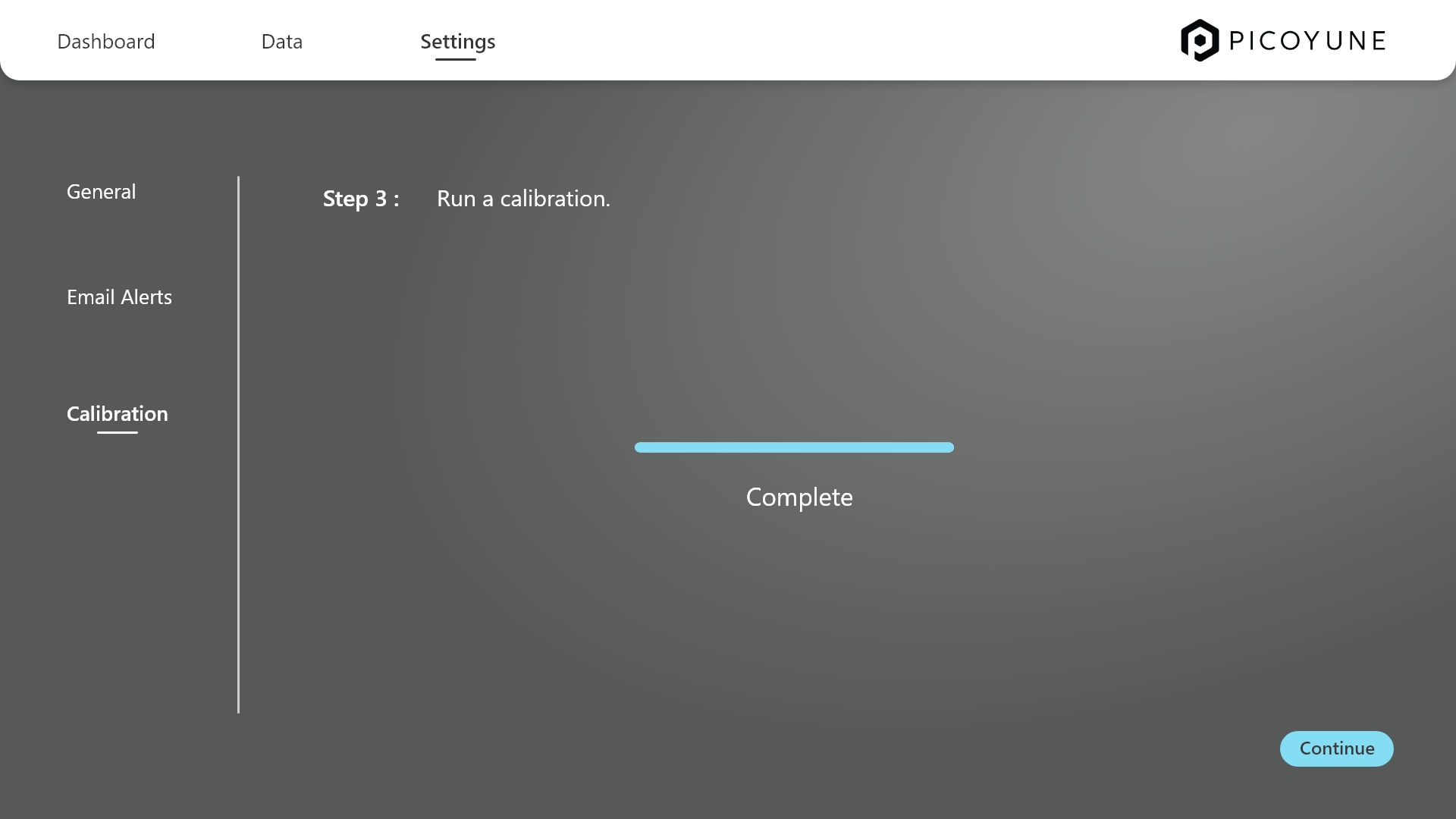
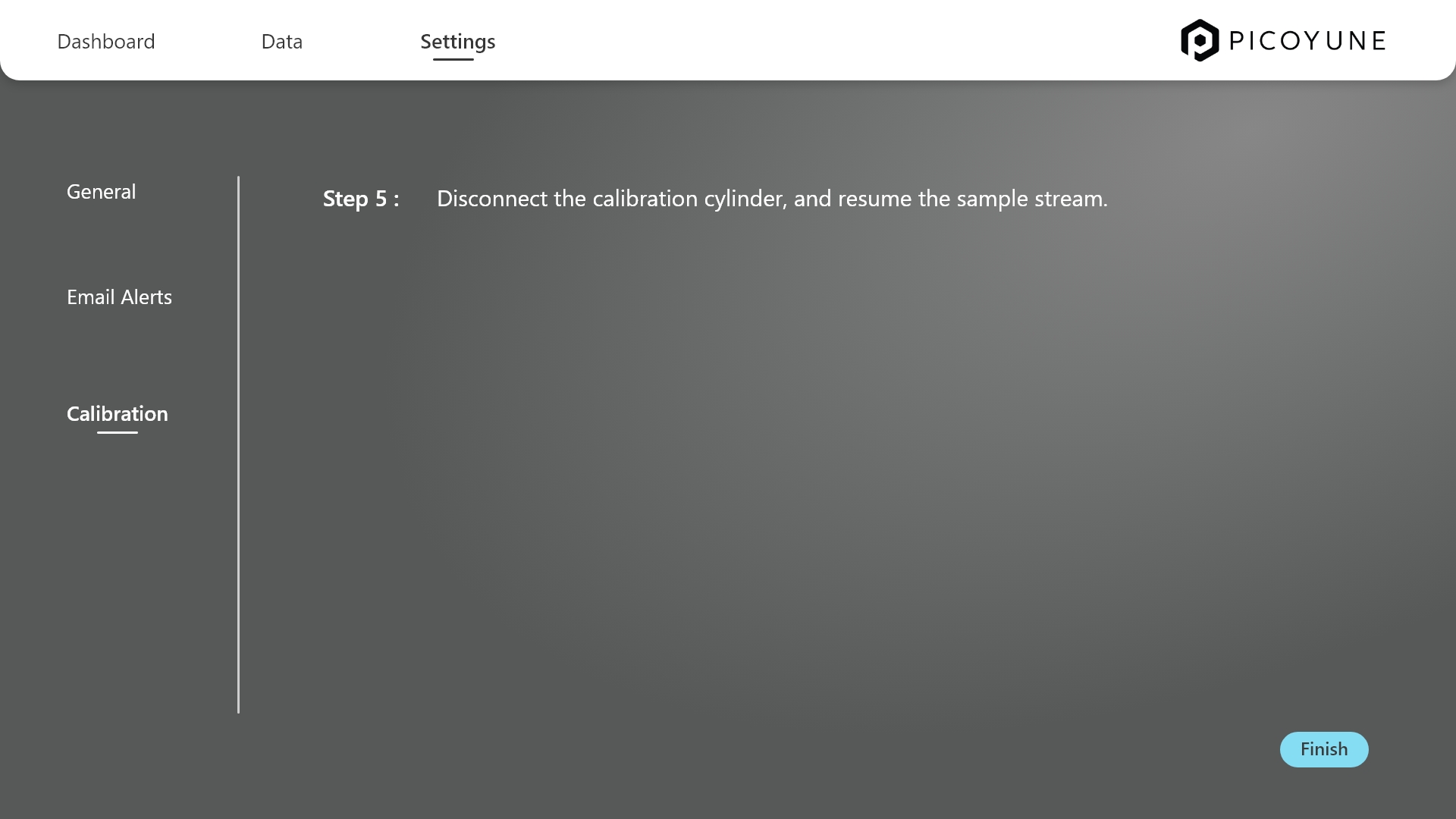
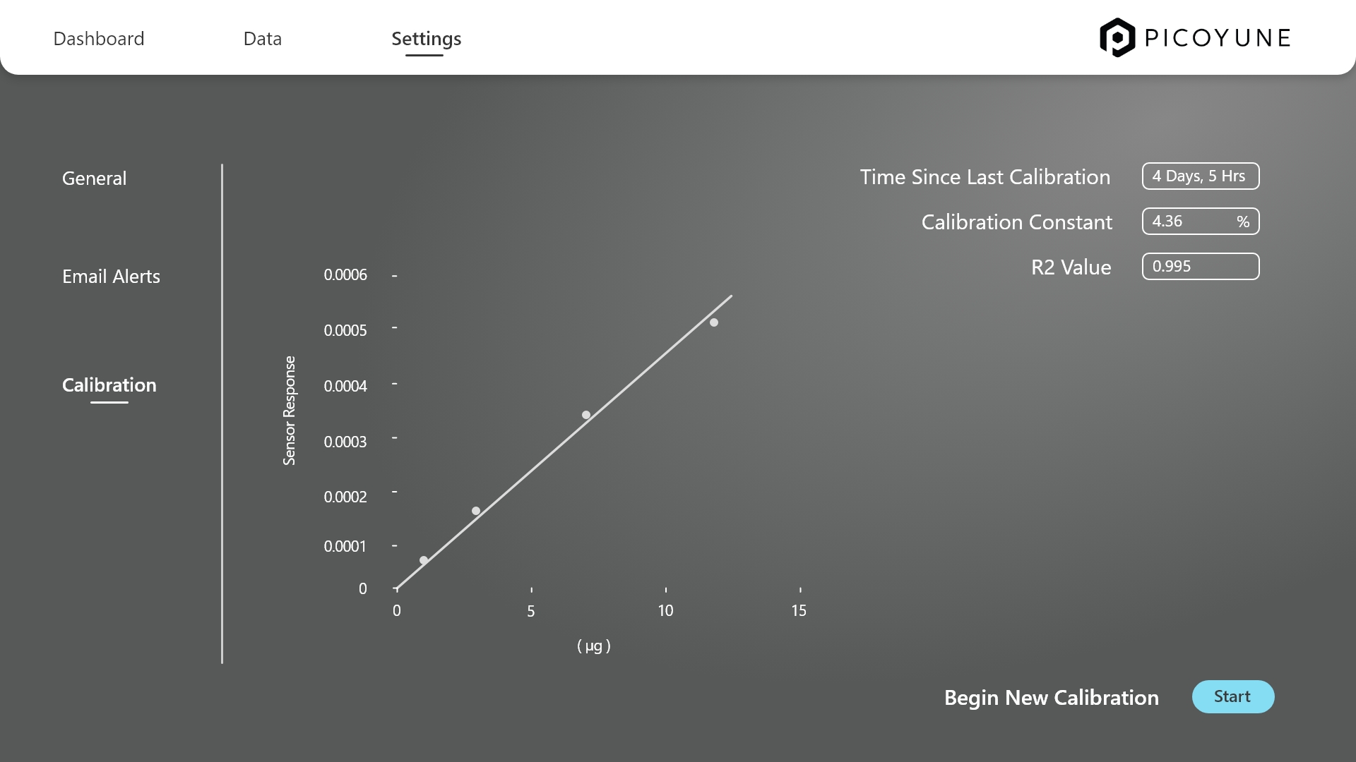
Sensor calibrations
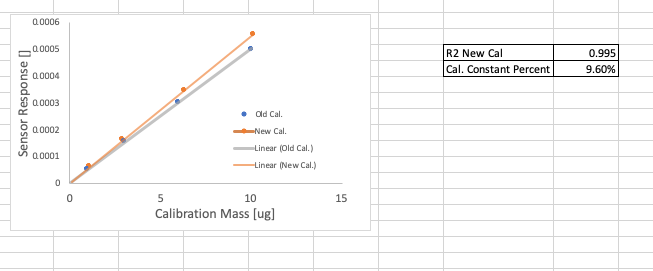
To create a polished UI based on the calibration graph provided in Excel, I started by translating the raw scientific data into a clear, interactive visual story that aligns with Picoyune’s modern aesthetic. The original chart compared sensor response data between old and new calibration methods—a critical insight I preserved by designing a graphing module that emphasized trend clarity, axis precision, and responsive behavior.
I refined the layout to highlight the contrast between the two calibration sets, using brand-aligned colors for the “Old Cal.” and “New Cal.” plots, and ensuring the R² value and percent calibration constant were surfaced contextually.
The step-by-step calibration flow was designed to walk users through the entire process with clarity—from connecting and configuring the necessary hardware to successfully calibrating the gauge. Each step presents just the right amount of information, reducing cognitive load while helping users stay focused on what’s essential. Built-in safeguards allow users to pause or abort an in-progress calibration, and easily discard previous runs if needed, ensuring flexibility and control throughout. In short, the calibration UI distills a complex technical workflow into a guided, fail-safe experience that prioritizes user focus, recoverability, and operational confidence
The takeaway
Working on Picoyune challenged me to distill highly technical scientific processes—like plasmonic sensor calibration—into experiences that feel intuitive, intentional, and brand-aligned. I learned to translate raw data and Excel visuals into interactive UI components that communicate complex insights with clarity, while maintaining a visual language that’s modern, trusted, and highly usable in the field. Every screen was a study in balancing functional density with breathing room, and using design not just to inform, but to anticipate. Moving forward, one strategic opportunity is to introduce adaptive workflows based on user roles—giving field technicians, lab analysts, and managers access to just the right depth and tools for their context, while reducing friction and accelerating adoption across teams.