This peer-to-peer boat rental app was my first end-to-end app design, created as the capstone project for Springboard’s UX bootcamp. The goal was to connect boat owners and renters through a seamless, community-driven platform—simplifying the rental process while giving boat owners the opportunity to offset ownership costs. I designed with both sides in mind: renters needed clear listings, intuitive search, and reliable communication tools, while owners prioritized trip management, fleet availability, and revenue tracking. The project gave me hands-on experience applying user-centered design principles to a real-world product and laid the foundation for how I approach thoughtful, scalable UX.
My role
As the designer responsible for this capstone project, I was tasked with creating a complete end-to-end mobile app—from initial concept to final UI. It was a solo effort that required wearing every hat—from product idea to high-fidelity design handoff.
Challenge
The high cost of boat ownership and rental creates a financial barrier that limits access for most individuals, while many owners struggle to justify their expenses due to underutilization.
Goal
To craft an intuitive peer-to-peer boat rental experience that effortlessly links renters and owners through a streamlined, trust-focused platform.
Process
I applied the design thinking process by empathizing with boaters’ real-world frustrations, defining the core rental and ownership challenges of boating, ideating solutions, prototyping a user-friendly interface, and iteratively testing to refine the experience.
Toolkit
Adobe Xd
Adobe Photoshop
Adobe Illustrator
Miro
User Interviews
Secondary Research
Design thinking
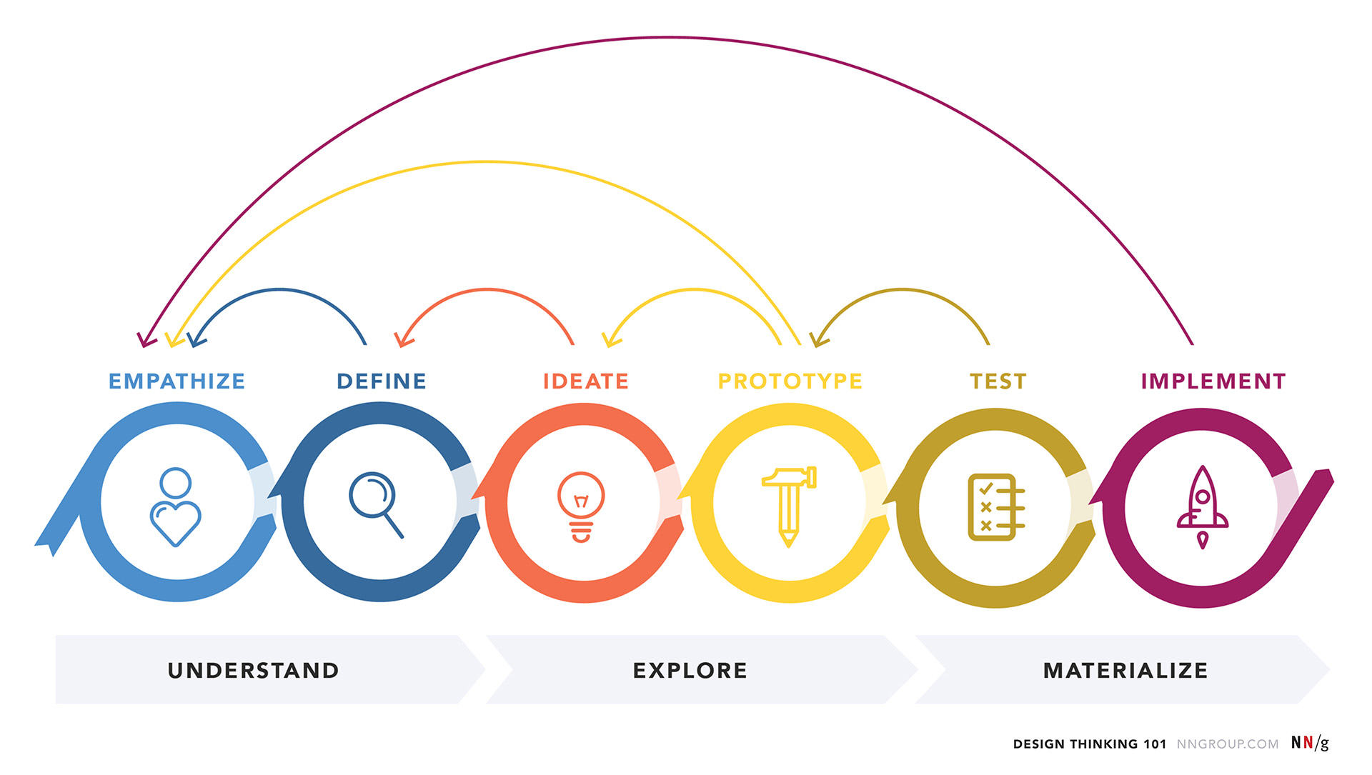
This was my first time applying the proven design thinking process, a method that gave me a structured yet flexible framework to explore the problem space and uncover genuine user pain points. Following the six steps defined by Nielsen Norman Group—Empathize, Define, Ideate, Prototype, Test, and Implement—This process was not only intuitive but also essential in shaping an app that users would actually want to use.
Secondary research
Through secondary research, I uncovered key patterns in U.S. recreational boating that informed both user personas and product strategy. With over 12 million registered boats and 140+ million participants in boating activities, the market showed strong engagement and an established owner base. Most boats were small, towable vessels under 26 feet—ideal for peer-sharing—which aligned well with the concept of a rental platform.
Affordability surfaced as a major concern: 62% of owners had household incomes under $100,000, and boats were used on average just 14 days per year. This gap between cost and usage, combined with significant ownership expenses, reinforced the appeal of a flexible, sharing-based model. I also took note of the growing pre-owned boat market and cultural openness to nontraditional ownership—indicators that shaped the platform’s value proposition.
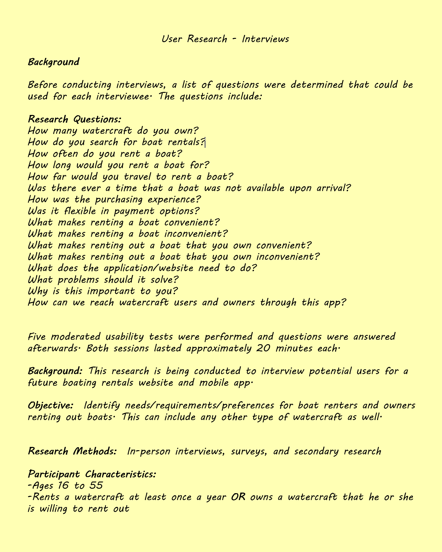
User research - Interviews
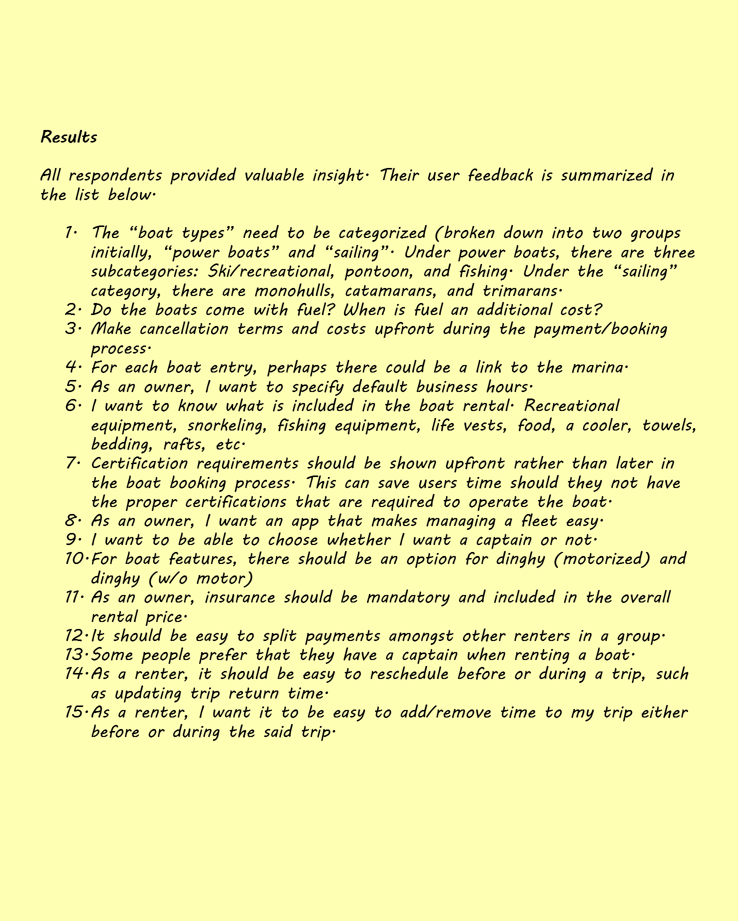
The findings from the secondary research gave me a better idea of what I needed to focus on while conducting firsthand user research. It also gave me an overall view of the market landscape and user journey, which prepared me for formulating questions to ask during the user interviews as shown below. It is important to note that a pre-screener survey was conducted to ensure I was targeting individuals relevant to the study. The questions used in the interviews were phrased and organized in a way not to introduce any bias. When conducting user interviews, I always inform participants that there is no right or wrong answer. Participants should feel comfortable knowing that they are expressing their thoughts and feelings without judgement.
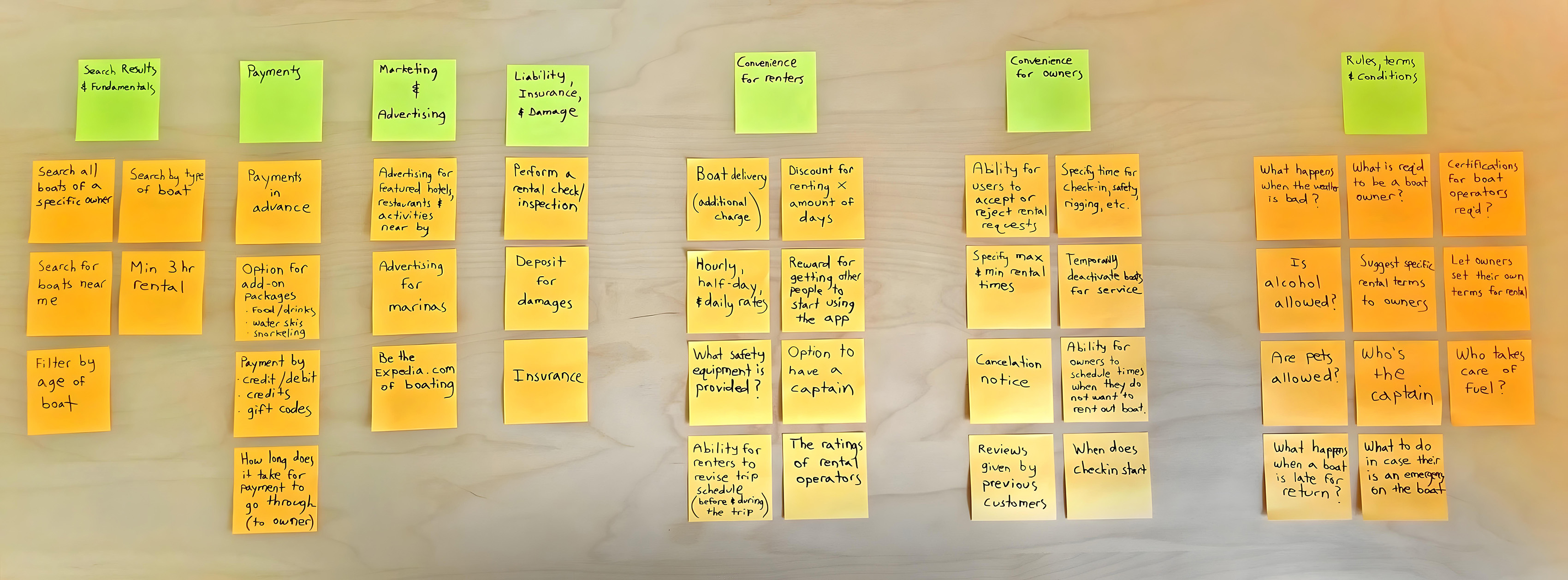
Synthesizing user research findings
To make sense of the feedback I gathered from user interviews, I synthesized the findings into an affinity map—a visual tool that helped me organize and interpret recurring themes, pain points, and insights. I began by breaking down interview notes into discrete observations or quotes, each captured on a virtual sticky note. Then I grouped similar notes based on emerging themes—such as search results and fundamentals, payments, conveniences for boat renters and owners, as well as general rules and conditions.
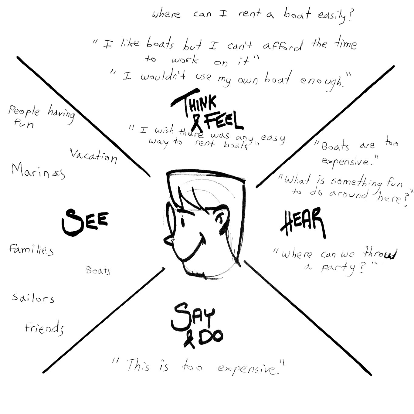
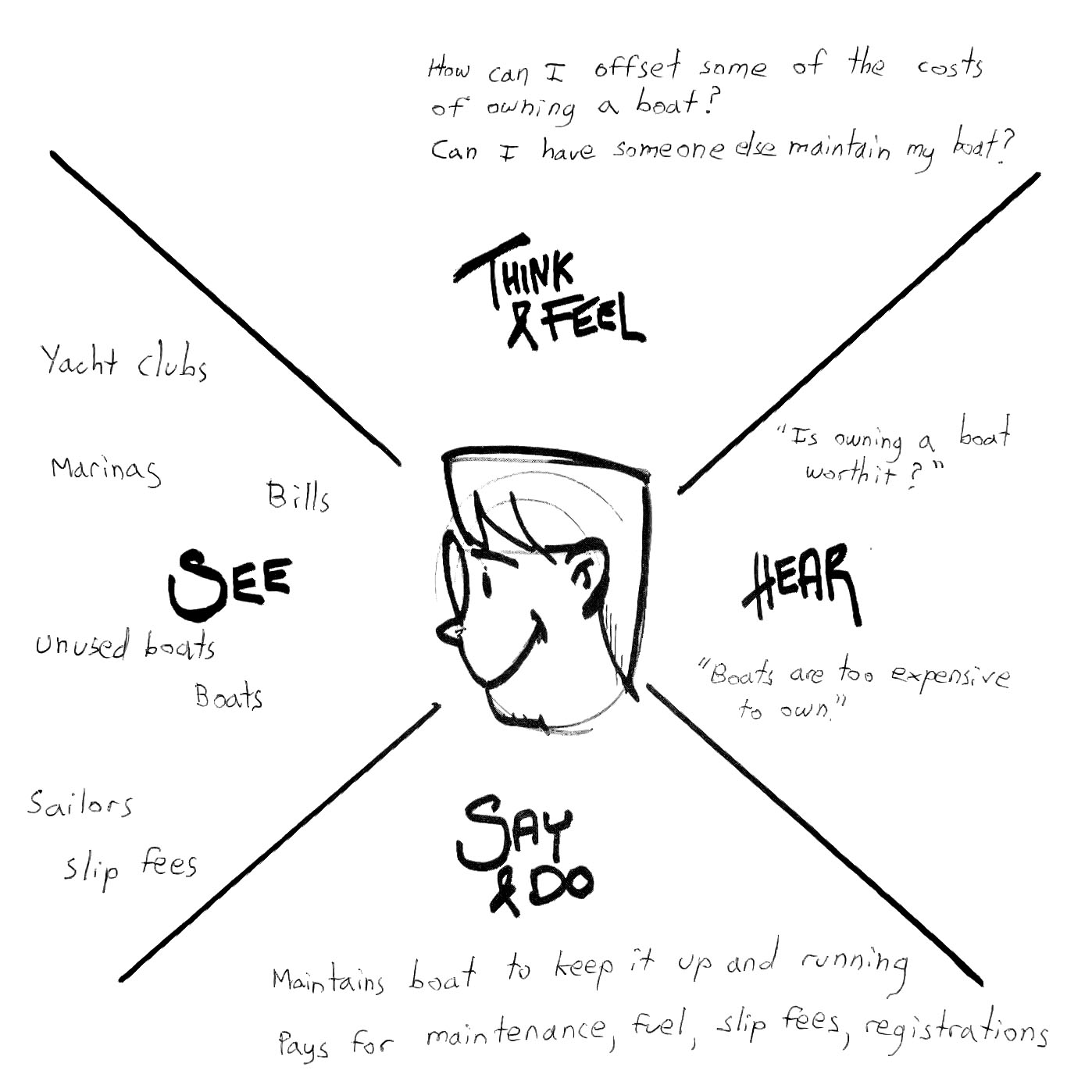
Empathy mapping
For boat renters, the empathy map revealed a common mindset: they love the idea of being out on the water, but not the long-term commitment that comes with owning a boat. Many voiced concerns like “Boats are too expensive,” or “I wouldn’t use one enough to justify buying it.” Others emphasized wanting the joy of the experience without the burden—“I don’t want to deal with maintenance; I just want to enjoy it when I have time.” For boat owners, the empathy map highlighted concerns around liability, overhead costs, and long periods of time without use. They wanted reassurance, control, and streamlined tools to manage listings without constant back-and-forth. These insights underscored a strong desire for flexibility, affordability, and hassle-free access. The empathy map helped crystallize what renters and owners were truly seeking: a simple, low-pressure way to connect with the water—without owning an anchor of responsibility.
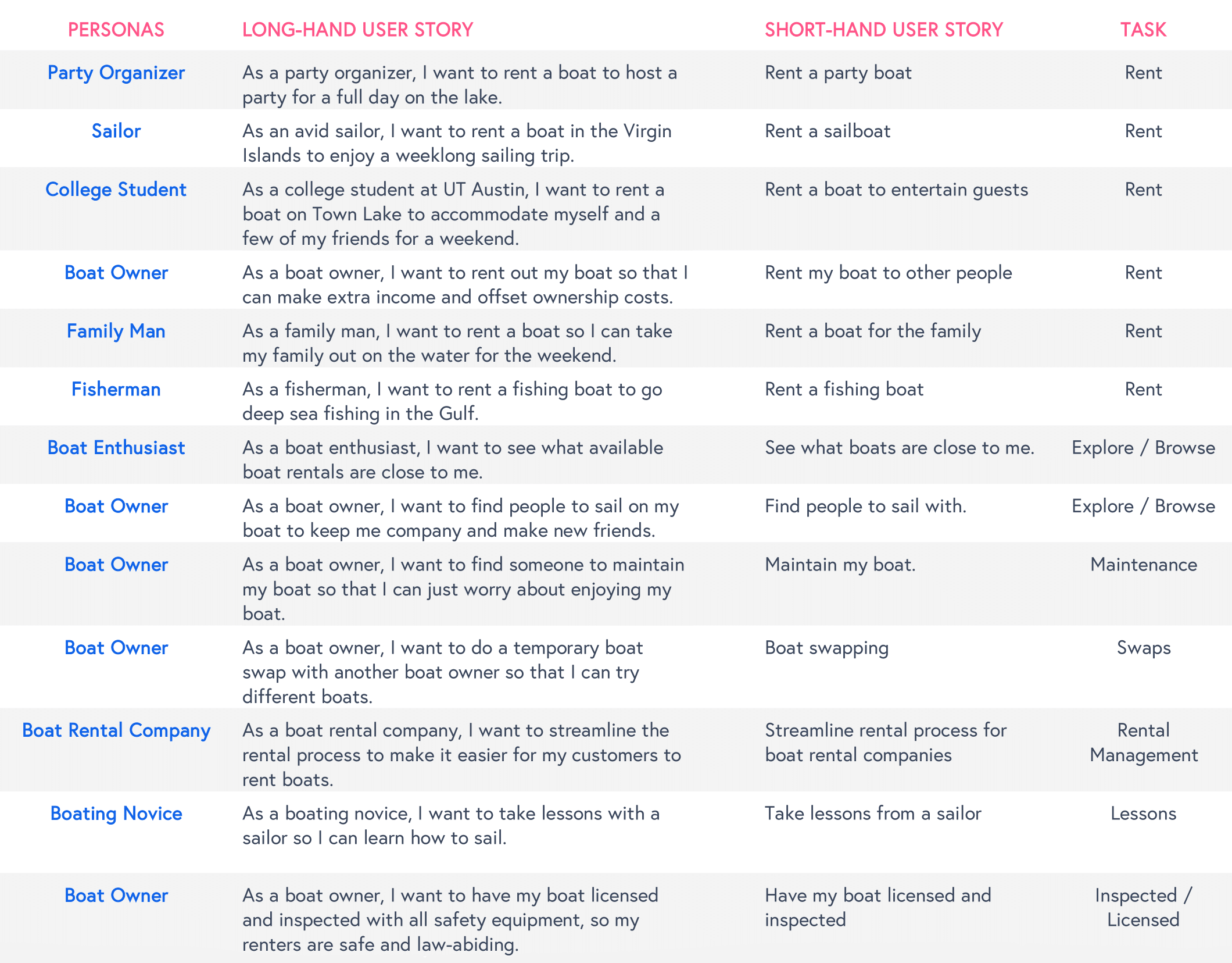
User stories
Based on well-defined empathy maps, I crafted user stories that represented the distinct goals of key personas. For renters, I covered a range of use cases—from party organizers planning group outings, to college students seeking budget-friendly options, to fishermen, sailors, and families, each with their own priorities. On the owner side, I focused on individuals looking to offset boat ownership costs and rental companies aiming to streamline listings and communication. These stories helped prioritize features and informed a user experience rooted in real-world behaviors.
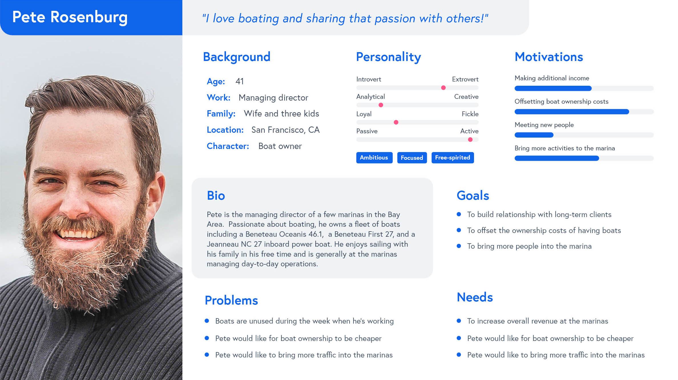
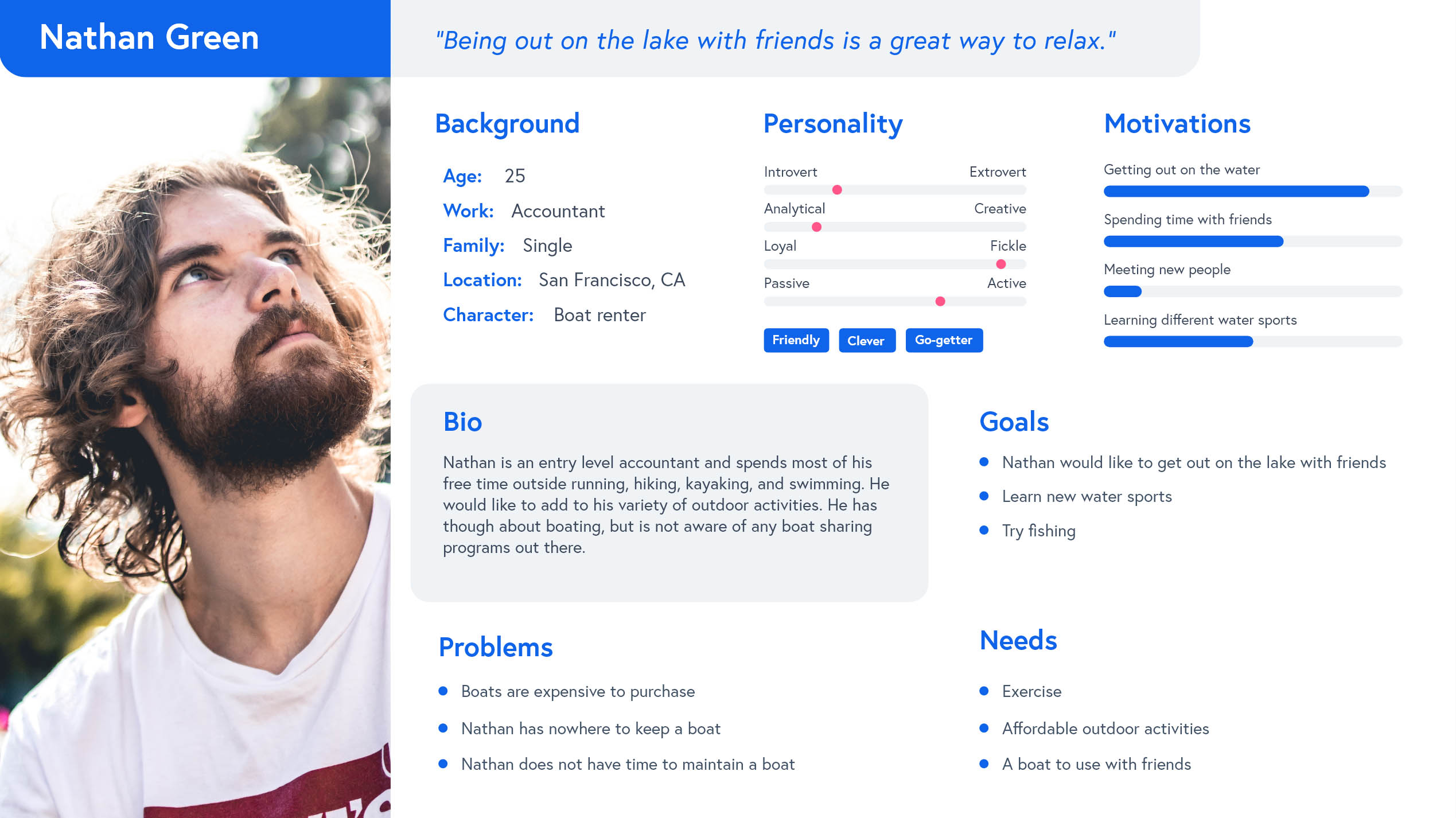
Personas
With well-defined user stories that help surface the specific motivations, goals, and contexts that users operate within, I started to notice patterns: what matters most to them, what tasks they’re trying to complete, and what barriers stand in their way. These recurring traits and needs are what became the backbone of both renter and owner personas. The result was a set of personas that are more than just fictional characters—they’re strategic tools that reflect authentic user mindsets and guide design decisions with purpose.
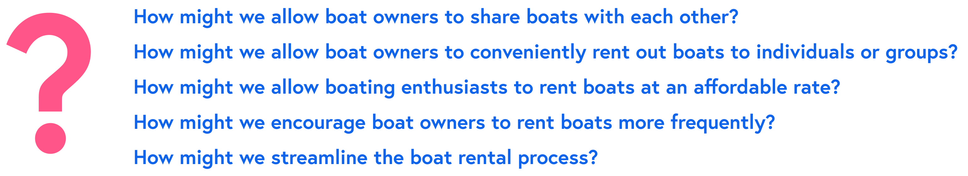
HMW questions
To guide the ideation phase, I synthesized my research findings into strategic “How Might We” prompts, which helped me reframe user pain points into actionable design challenges. This technique pushed me to look beyond obvious solutions and explore a broader range of ideas grounded in real user needs. It also ensured I stayed focused on opportunities that addressed both boat owners’ concerns and renters’ expectations.
Competitive analysis
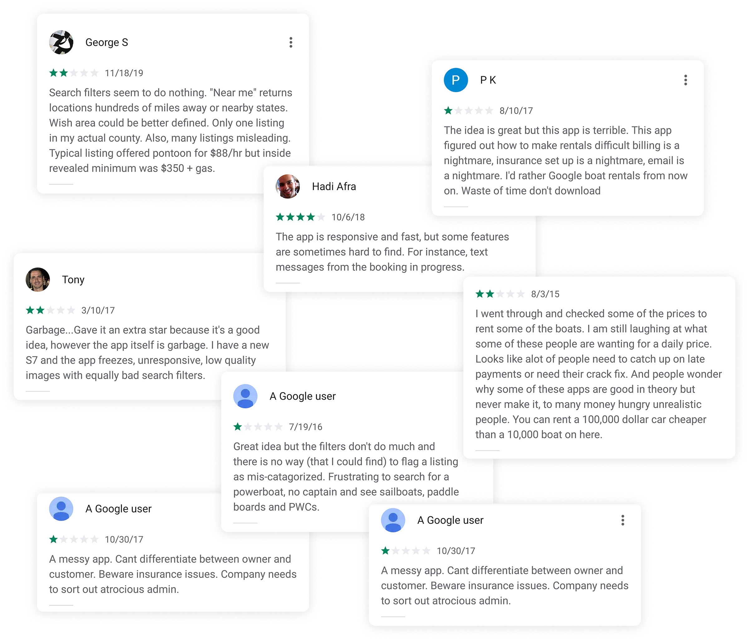
To complement the user research, I conducted a competitive analysis of existing boating platforms to understand how others in the space were solving similar problems. This gave me a broader industry perspective and grounded my design direction in both user needs and market expectations. Additionally, it helped me benchmark usability patterns, identify feature gaps, and uncover opportunities for differentiation. It also ensured I wasn’t reinventing the wheel—but instead learning from what worked, avoiding common pitfalls, and making informed design choices with both users and the market in mind.
It was also beneficial to study the user feedback through app reviews. Studying this user feedback gave me an honest look at real-world frustrations and wins. I uncovered common pain points like confusing billing processes, poor app usability, and unclear pricing—many of which aligned with my own research. It added valuable context and helped me design solutions that addressed what users were actually saying, not just what the interface suggested.
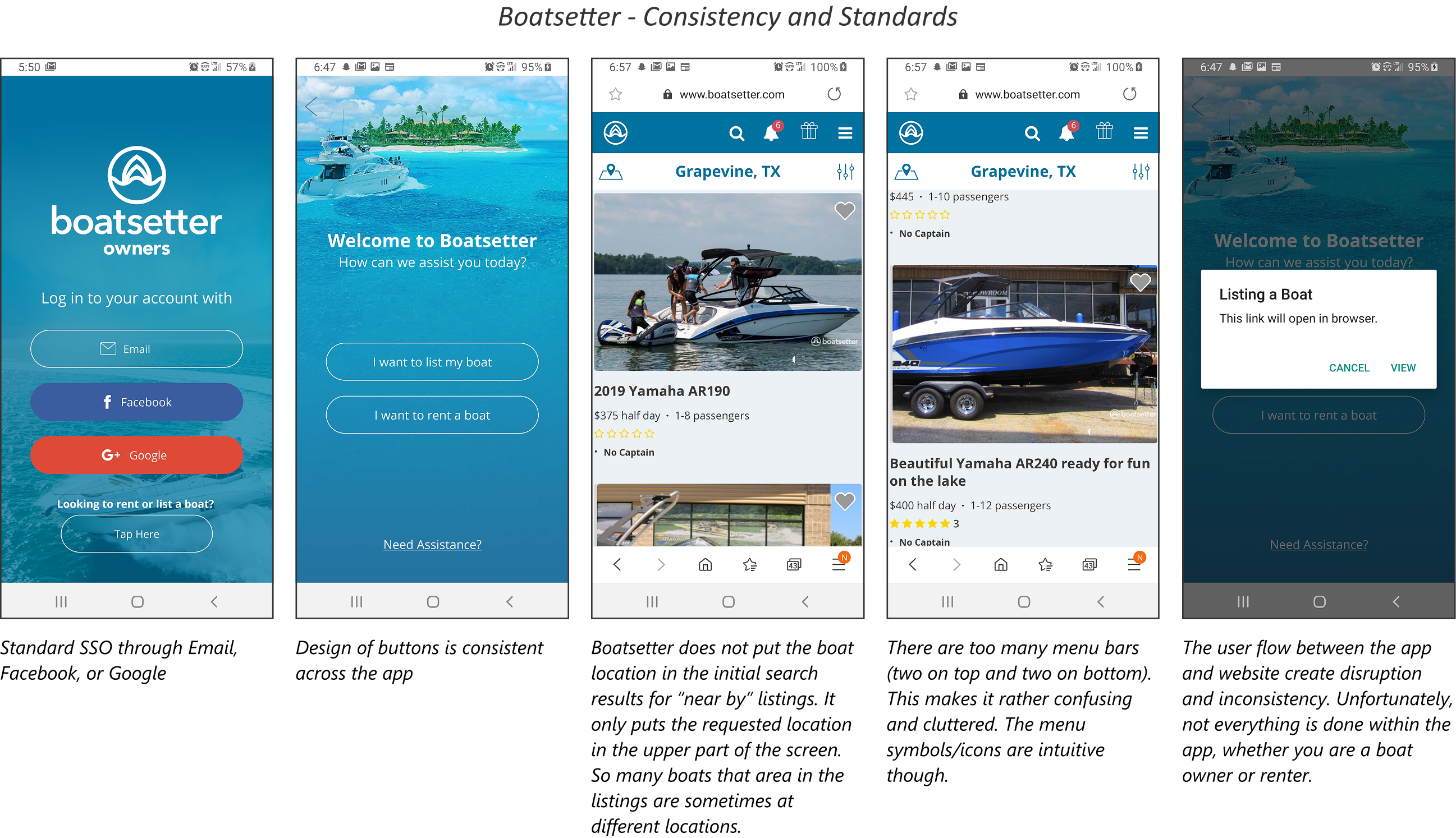
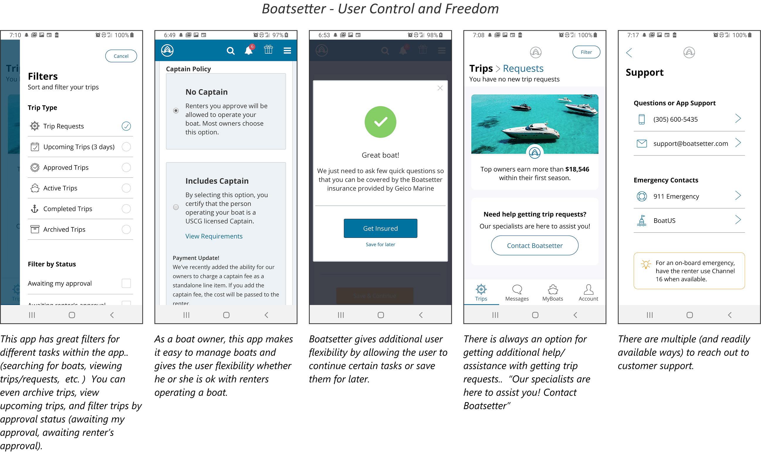
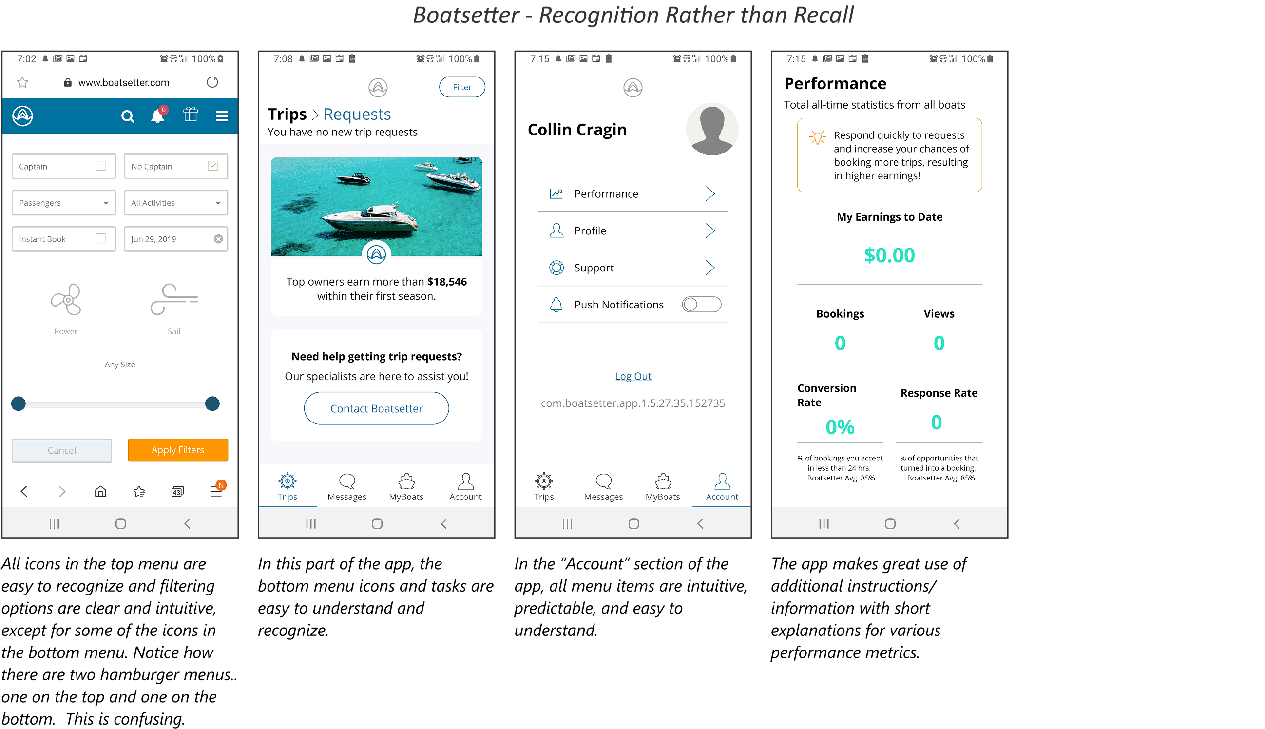
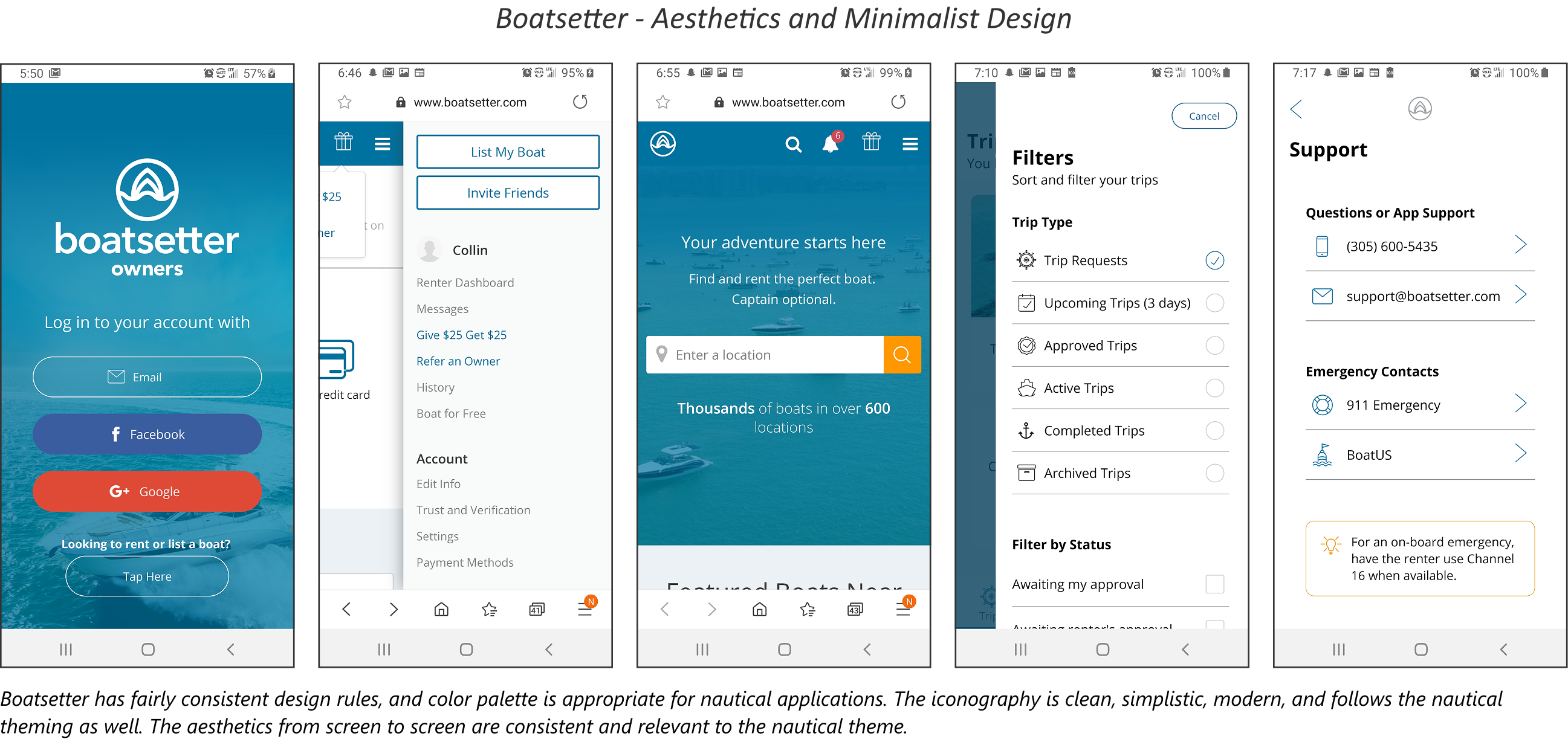
Heuristic evaluation
Diving deeper into competitive analysis, I conducted a heuristic evaluation of Boatsetter, Get My Boat, and Click&Boat, the most popular boating apps, to better understand how well each app meets established usability standards. Using Jakob Nielsen’s ten usability heuristics as a lens—like consistency and standards, error prevention, and recognition rather than recall—I critically examined the app’s user interface, navigation, and overall functionality. This approach allowed me to spot areas where the app excelled, like its clear visual hierarchy and booking flow, as well as places where it could be more intuitive or efficient.
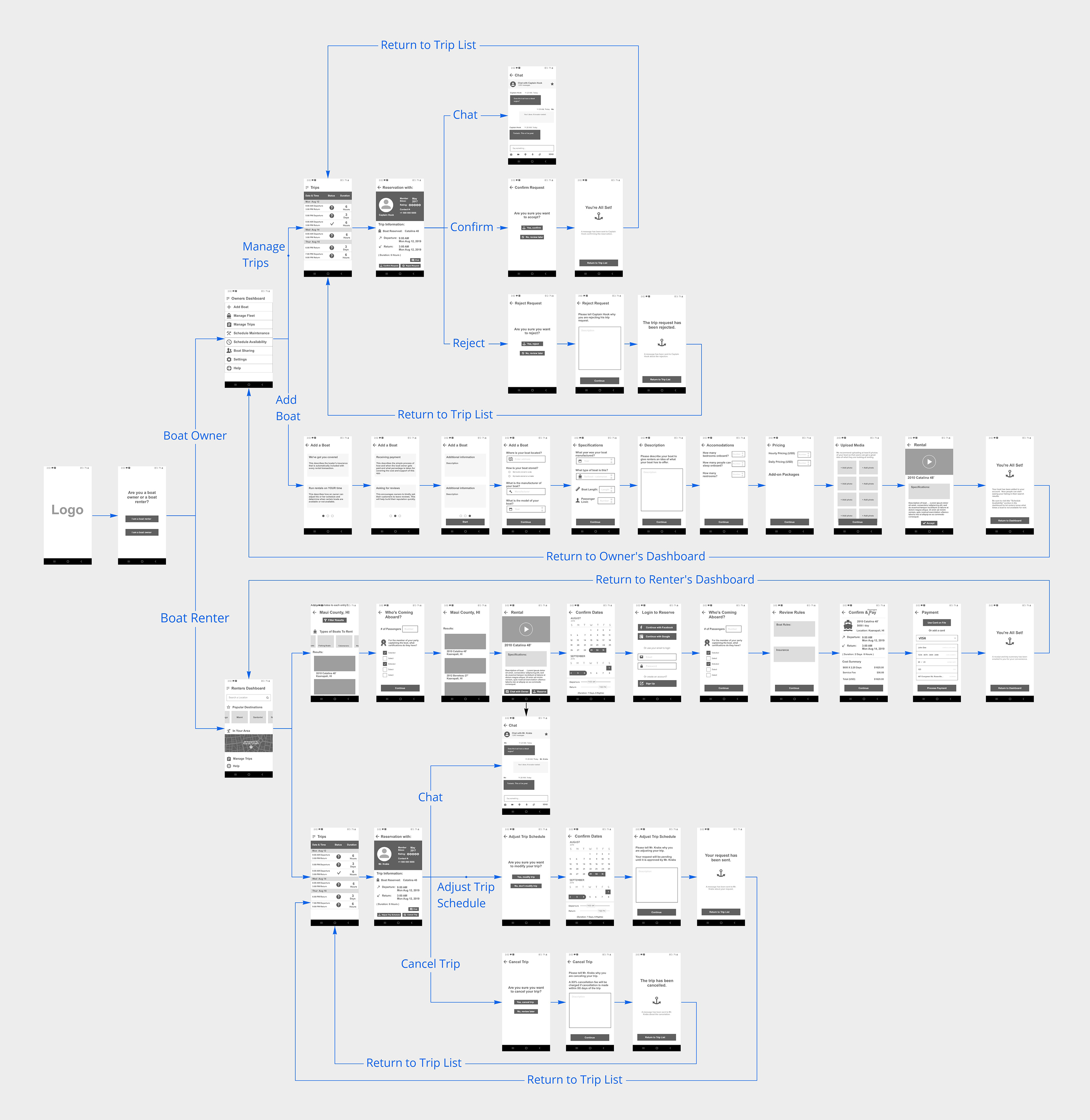
Wireflows
I translated insights from user research and competitive analysis into a streamlined journey focused on high-impact actions for both boat owners and renters. Instead of covering every interaction, I prioritized core tasks—like listing a boat, browsing rentals, and completing bookings—bringing them to life through wireflows that emphasized usability and efficiency.
I mapped key flows for each user type: owners uploading boats, setting availability, and managing requests; renters discovering listings, filtering results, booking, and messaging. I also captured where their experiences intersected, such as booking approvals and communication. This focus on foundational tasks created a scalable framework ready for future features like reviews and post-trip feedback.
Testing with users
To evaluate the usability of the app’s core experience, I created clickable high-fidelity prototypes in Adobe XD, simulating key user flows across both renter and owner paths. The process was deliberately iterative and feedback-driven. After each round of testing, I synthesized findings into actionable insights and revised the prototypes to address points of confusion or friction. I paid particular attention to areas where users hesitated, backtracked, or required verbal clarification—using these as signals for design refinement. This loop of prototyping, testing, and refinement helped shape an experience that felt intuitive, trustworthy, and aligned with user mental models.
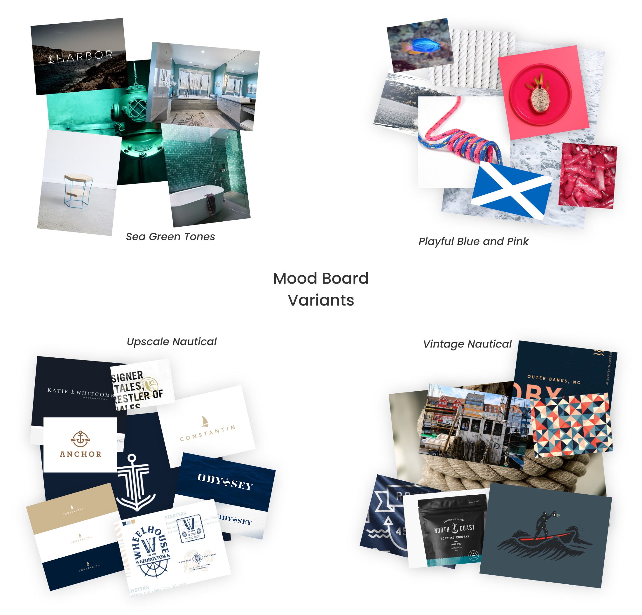
Mood boards
Bringing the app to life went far beyond wireframes and user flows—it needed a brand identity that truly resonated. I knew from the start that the name, theme, and overall aesthetic would be just as critical to the user experience as the functionality. So I dove deep into exploring different visual and emotional directions. But as I layered on more research and thought about the diverse user base, I realized the brand needed to strike a more playful and welcoming tone. That’s when things clicked. I leaned into an identity that felt approachable, light-hearted, and inclusive.
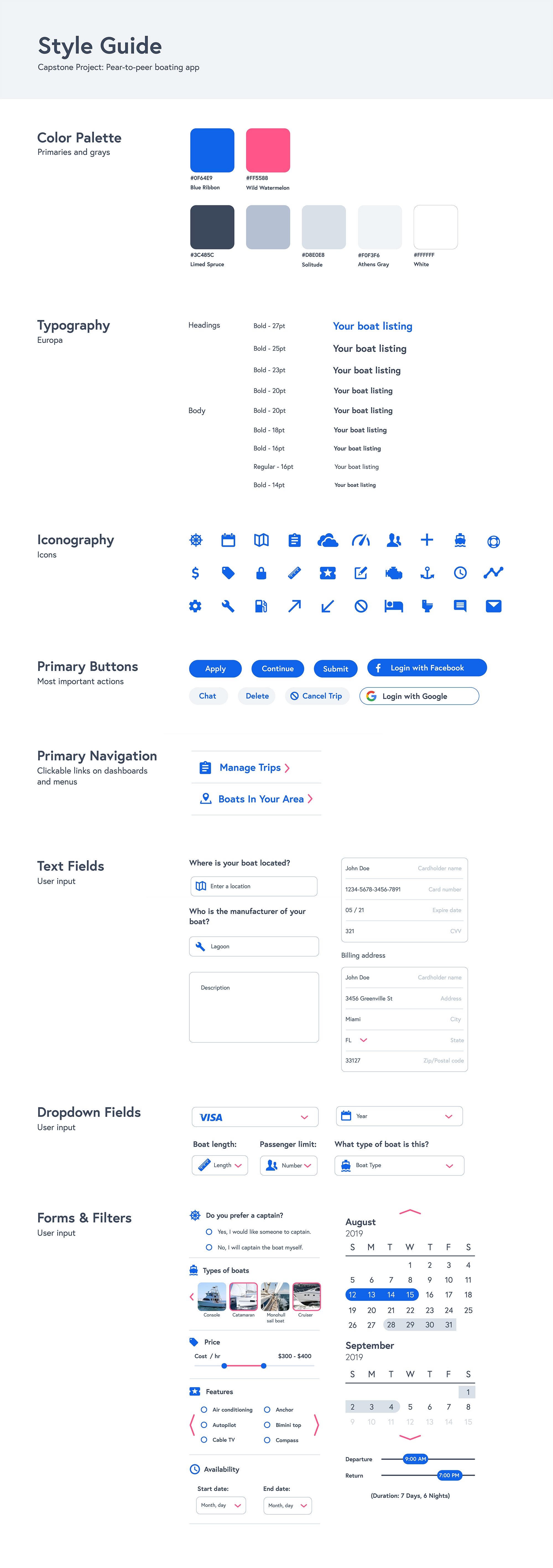
Style guide
Establishing a strong style guide was the next crucial step in shaping a consistent, user-friendly experience. I approached it not just as a visual checklist, but as a strategic bridge between branding and usability. The goal was to define a look and feel that echoed the playful, approachable identity I had established—while grounding it in clarity and function. I curated typography, color systems, and iconography that supported scannability and accessibility, favoring clean lines, open space, and subtle hierarchy to guide the eye. Each decision was intentional, crafted to balance personality with usability.
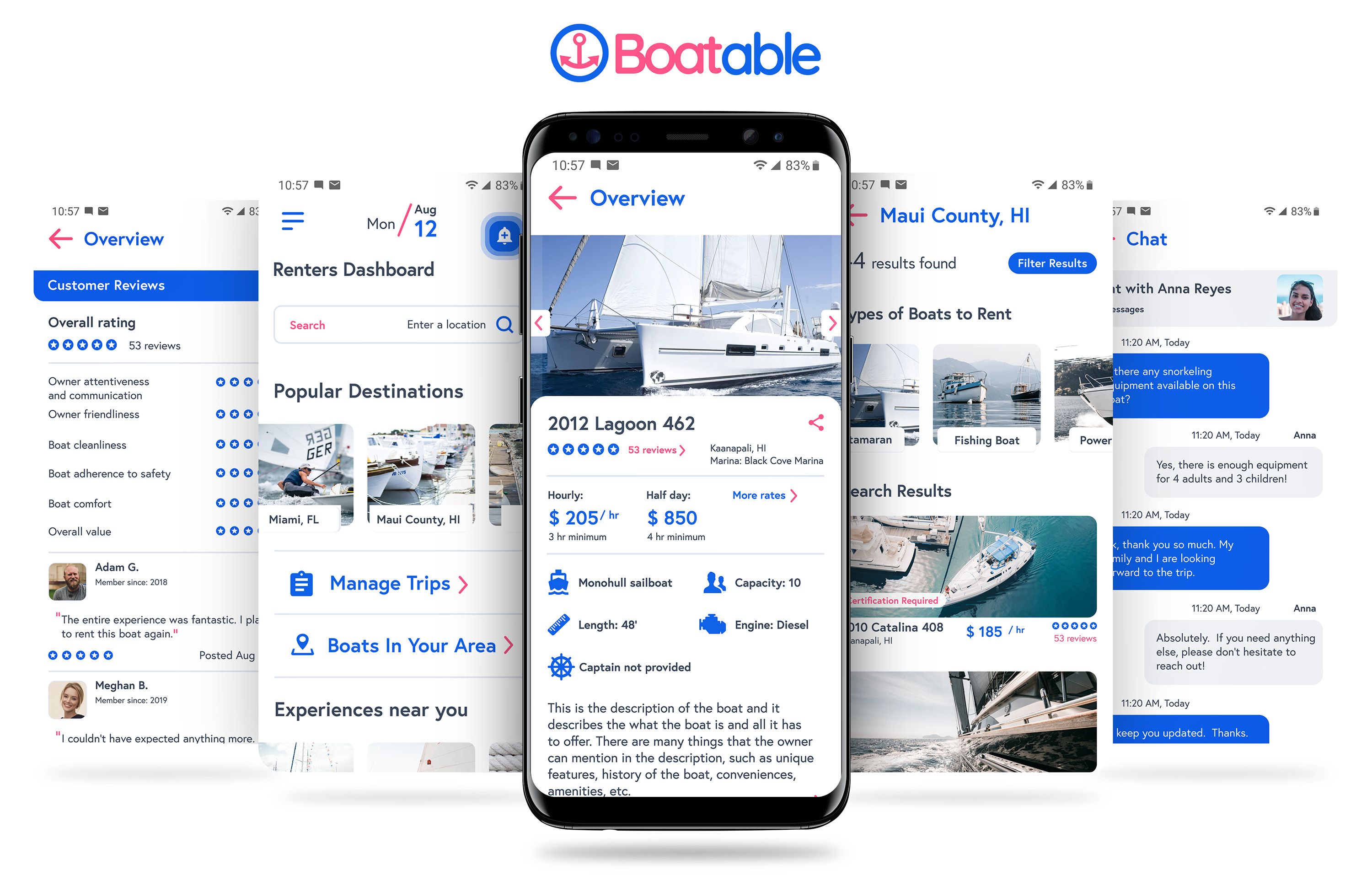
The look and feel
Having a solid brand and design system in place gave me the structure I needed to bring the app’s core screens to life. With consistent UI patterns, defined colors, and purposeful typography already established, I could focus on building interactions that felt natural and intuitive. Each screen was designed to reflect real user goals and behaviors—whether browsing boats or responding to a booking—while keeping the interface approachable and cohesive.
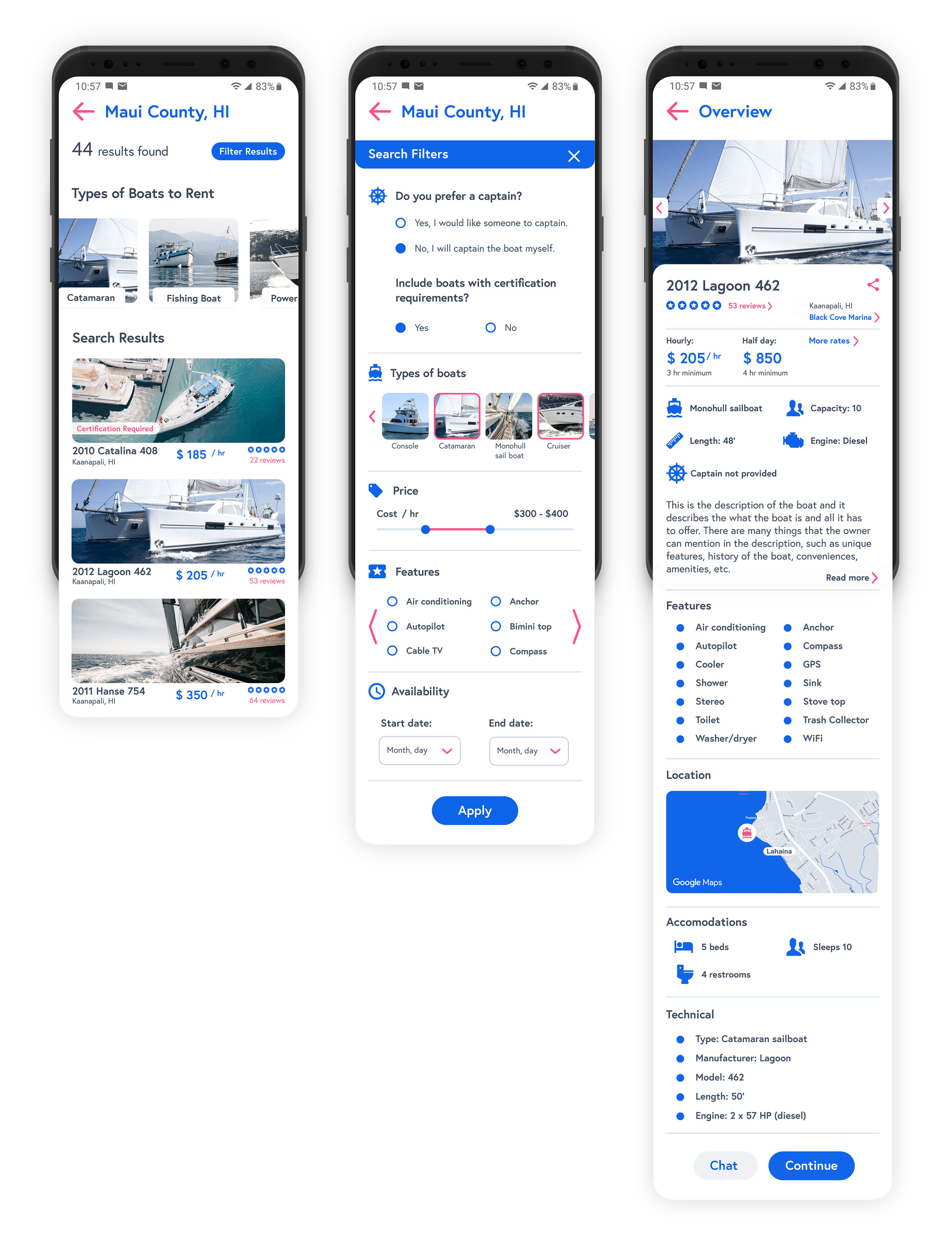
Searching for boat
I started designing the search experience knowing it would be the true entry point to the app—the moment where users form their first impression and decide whether they trust the platform to deliver what they’re looking for. This design balanced usability and transparency, helping users feel informed and in control from the moment they searched to the moment they booked.
Onboarding and booking
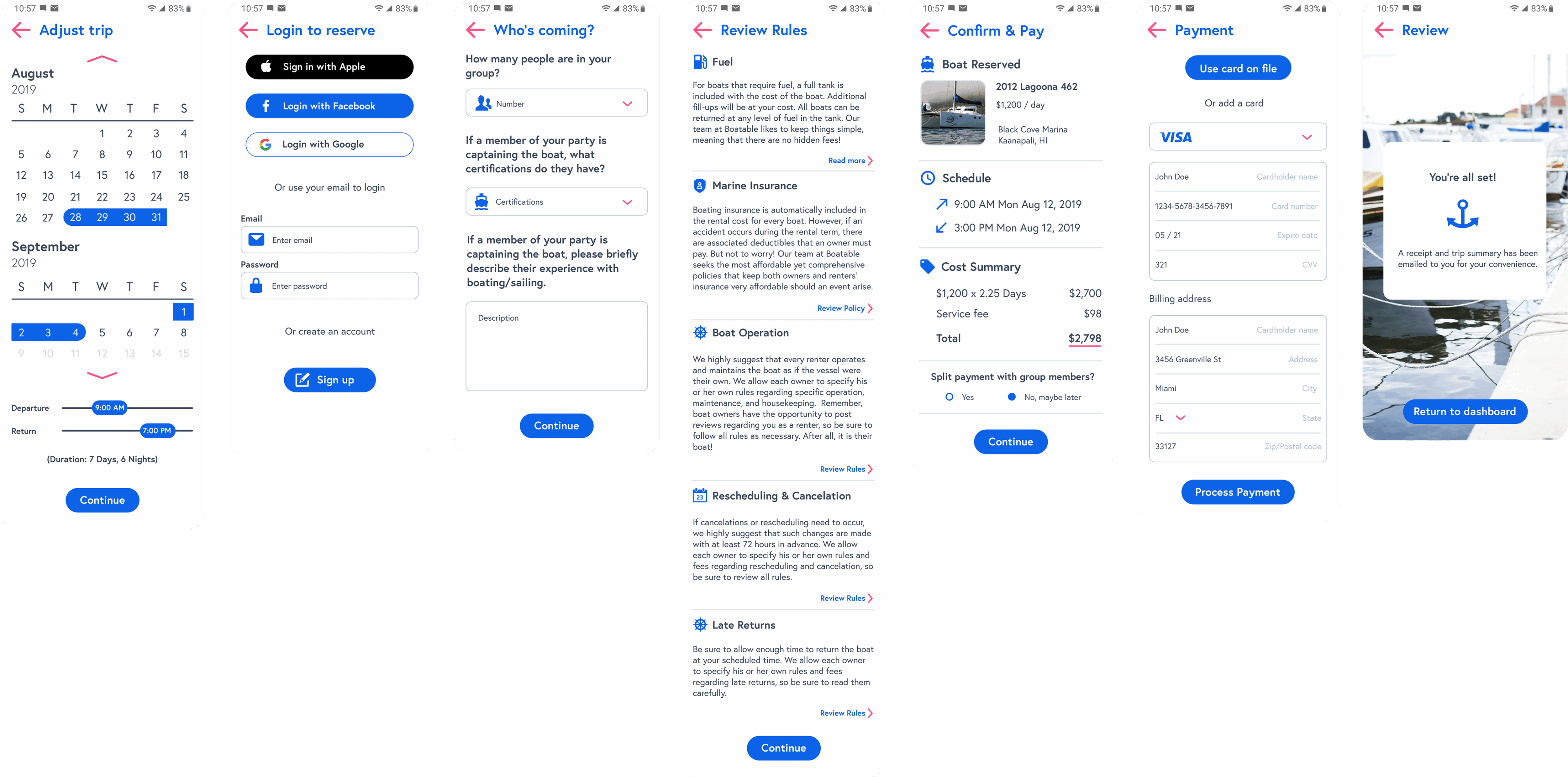
I designed the app’s onboarding flow with a focus on simplicity, flexibility, and user autonomy. Rather than gating the experience behind a registration wall, I allowed users to dive straight into exploring listings the moment they opened the app. Onboarding didn’t begin until they found a boat they were actually interested in booking—a deliberate choice that respected their time and lowered the barrier to engagement. This approach offered a smoother, more welcoming entry point, giving users the freedom to browse and build trust before being asked to create an account or enter details.
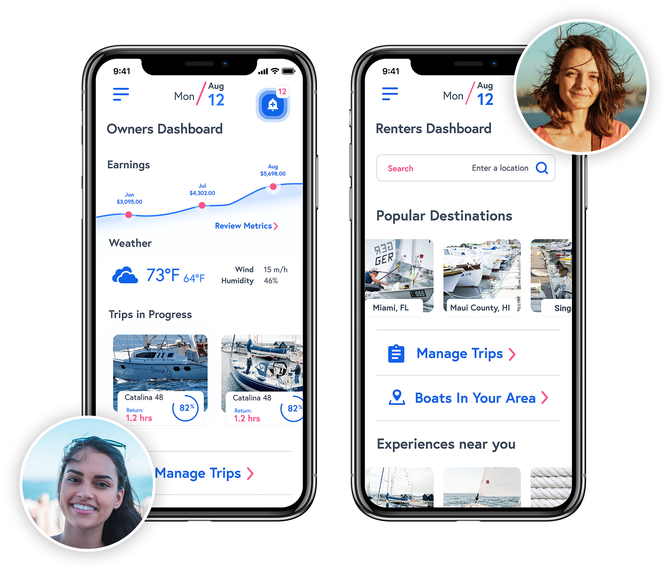
Two dashboards, Zero disruption
The owners dashboard was designed to function like a lightweight business hub. Owners wanted a simple, dependable way to manage active trips, update their fleet’s availability, and keep tabs on their earnings. I focused on surfacing key actions quickly—like confirming requests, setting availability windows, and viewing payout summaries—so owners could run their rental operations with minimal friction.
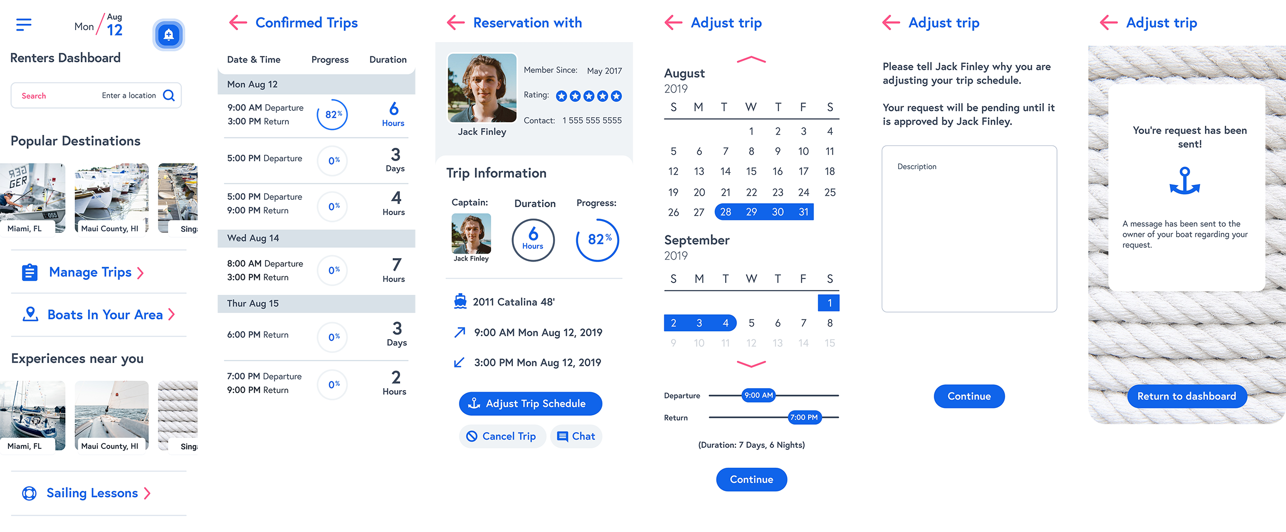
The renters dashboard, on the other hand, emphasized flexibility and discovery. Renters prioritized managing bookings and wanted a quick way to see what boats were available nearby. I built tools that let them search by location, date, and boat type—whether they were planning a local outing or exploring options in a different destination. Their dashboard kept trip details and recommendations front and center, making planning and follow-through seamless.
Adjusting a trip schedule
One of the recurring pain points I uncovered during research was how rigid and unforgiving the booking systems were on existing boat rental platforms. Renters often felt boxed in—unable to make changes once a trip was booked, and unsure how to communicate needs without starting over or jumping through hoops. I addressed this by designing a flexible and responsive trip management experience. Renters could easily modify key aspects of their bookings: extend an active trip if the day was going well, message the owner with last-minute questions or requests, reschedule a future outing if weather or plans changed, or cancel a booking altogether if necessary. Each option was accessible through a single, centralized trip dashboard—minimizing confusion and putting users in control.
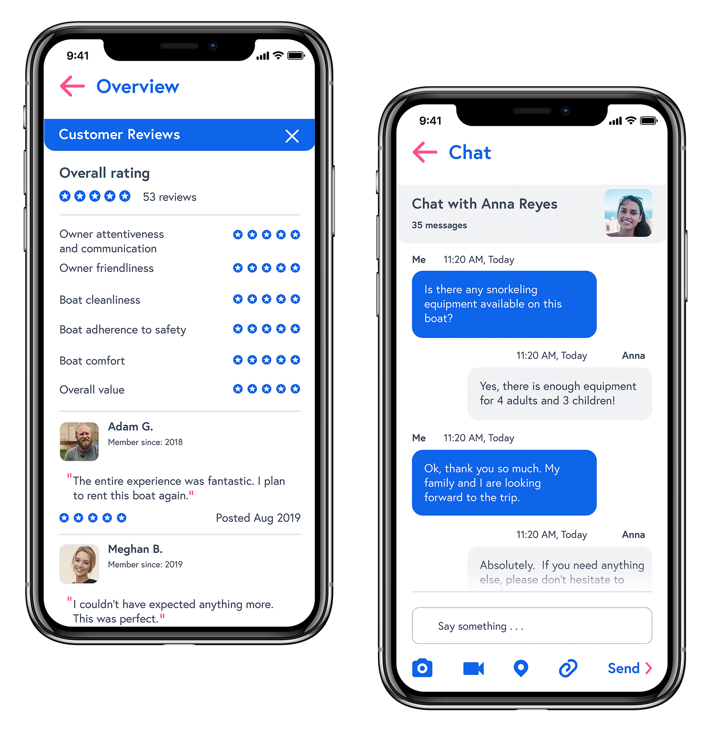
Social tools
To strengthen trust and communication, I designed two key features: a reviews system where renters could rate their experience and owners could respond, and a messaging tool that supported real-time conversations before, during, and after trips. Together, these features built transparency and made the overall experience feel more connected, personal, and user-driven.
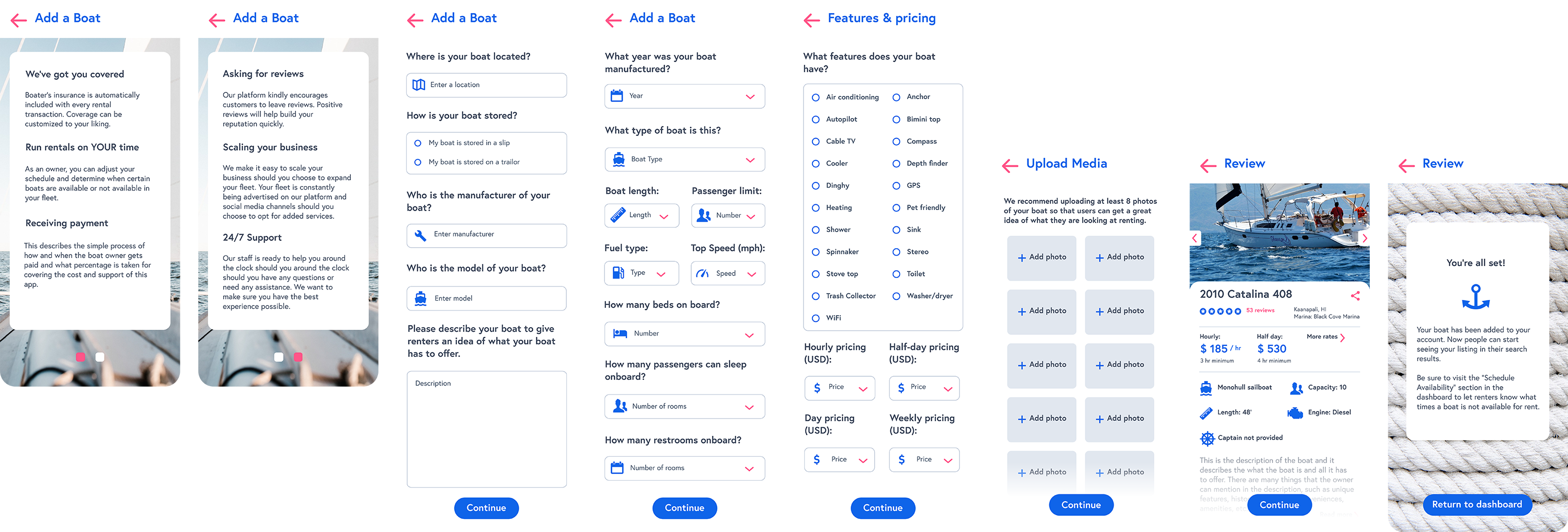
Setting sail with the first listing
To help boat owners attract renters and build trust, I designed a listing flow that made it easy to create detailed, appealing profiles for each boat. User research showed renters prioritized transparency, so listings captured everything from pricing and sleeping accommodations to onboard amenities like GPS, coolers, and paddleboards. The UI walked owners through each step—surfacing the right details at the right time—so they could showcase what made their boat stand out while giving renters the clarity they needed to book with confidence.
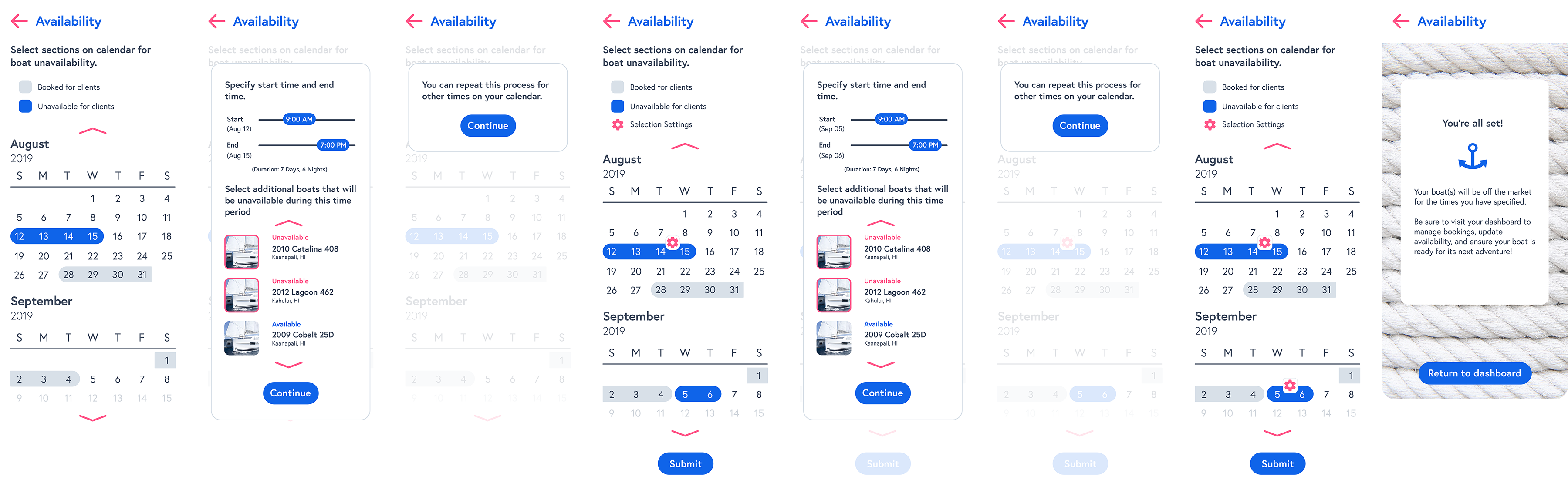
Availability that moves
Designing an availability scheduling system for boat owners meant creating an experience that felt less like admin work and more like a streamlined control panel for their business. I designed the boat availability experience with scalability, clarity, and control in mind—ensuring it could accommodate both casual owners and high-volume operators. The scheduling system allowed owners to define availability on a per-boat basis with flexible time blocks, including support for multiple daily windows and granular durations. Rather than forcing rigid scheduling templates, I prioritized open-ended input, enabling owners with the flexibility that they needed.
To increase efficiency at scale, I implemented a bulk availability flow that lets boat owners apply availability parameters across multiple boats simultaneously. This reduced cognitive load and eliminated redundant interactions, especially for rental businesses managing fleets. The UI was built around a responsive calendar layout with inline editing and clear status indicators—providing immediate feedback and minimizing scheduling conflicts. Together, these decisions supported faster setup, easier updates, and a more reliable booking experience.
Next steps
If I were to take the platform further, I’d introduce a shared vessel booking experience designed specifically for larger boats. The idea would be to allow multiple renters to book separate staterooms on the same vessel—splitting the cost while turning the trip into a more social, community-driven experience. The UX would walk users through available group trips with filters for date, location, group size, and even trip vibes (e.g., “relaxed cruise,” “snorkel-focused,” “sunset social”). Each listing would show remaining slots, who’s already signed up (if they’ve opted in to be visible), and what’s included in the experience. I’d also introduce smart trip coordination tools—group chat threads, shared itineraries, and a lightweight group agreement flow—to set expectations and ensure everyone’s aligned before boarding.
On the owner side, I’d build out a maintenance and compliance management flow—a toolset that helps them track key aspects of their boat’s condition and regulatory status. The UI would surface checklists and notifications for routine maintenance, safety gear inspections, and registration or insurance expirations. Owners could log completed tasks, upload documents, and even get reminders based on usage patterns or seasonal requirements. It’d create peace of mind for owners and signal reliability to renters, reinforcing trust at every touchpoint.